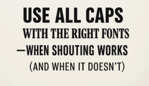
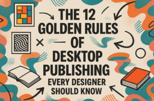
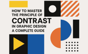
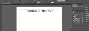
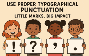
This article is a part of “The 12 Golden Rules of Desktop Publishing Every Designer Should Know“ Imagine designing a beautifully laid-out magazine or brochure — only to fill it with straight quotes, hyphen...
Read More
Use All Caps with the Right Fonts – When Shouting Works (and When It Doesn’t)
This article is a part of “The 12 Golden Rules of Desktop Publishing Every Designer Should Know“ YOU’VE SEEN TEXT LIKE THIS, RIGHT?IT FEELS LIKE SOMEONE’S YELLING AT YOU. That’s the power — and...
Read More
Balance Line Length with Type Size – The Secret to Effortless Reading Flow
This article is a part of “The 12 Golden Rules of Desktop Publishing Every Designer Should Know“ Ever found yourself rereading a sentence multiple times, even though the words were simple? It might not...
Read More
Use Ragged-Right or Fully Justified Text Appropriately – It’s Not a Battle, It’s About Balance
This article is a part of “The 12 Golden Rules of Desktop Publishing Every Designer Should Know“ If you’ve ever had a debate about text alignment, you’re not alone. Some designers swear by justified...
Read More
Use Fewer Fonts – Mastering Typography with Simplicity
This article is a part of “The 12 Golden Rules of Desktop Publishing Every Designer Should Know“ If your design looks chaotic and cluttered, there’s a good chance it’s suffering from font overload. In...
Read More
Use Only One Space After Punctuation – The Typography Rule You Didn’t Know You Were Breaking
This article is a part of “The 12 Golden Rules of Desktop Publishing Every Designer Should Know“ Have you ever hit the spacebar twice after typing a period? You’re not alone — and you’re...
Read More
The 12 Golden Rules of Desktop Publishing Every Designer Should Know
Whether you’re creating a flyer, designing a brochure, or working on a multi-page newsletter, good design principles can make or break your project. Desktop publishing isn’t just about making things look pretty — it’s...
Read More
5 Essential Typography Tips Every Graphic Designer Must Know
Typography is the backbone of great design. Whether you’re designing a poster, website, brochure, or social media post, how your text looks plays a crucial role in catching attention and conveying information. In this...
Read More
How to Master the Principle of Contrast in Graphic Design: A Complete Guide
In the world of graphic design, if there’s one principle that truly helps grab a viewer’s attention, it’s Contrast. While many people mistakenly believe that contrast is only about colors, the reality is far...
Read More
How to Align Text in Adobe InDesign
Text alignment is a crucial part of creating visually appealing and professional layouts in Adobe InDesign. Whether you’re designing a flyer, brochure, or magazine, understanding how to align text properly ensures your content looks...
Read More
How to Change Quotation Marks in Adobe InDesign: A Step-by-Step Guide
Adobe InDesign allows you to customize quotation marks to suit the style and design of your text. Whether you’re preparing a document for a specific language or adhering to a style guide, this guide...
Read More
How to Create Vertical Text in Adobe InDesign
Creating vertical text in Adobe InDesign may seem a bit challenging at first compared to other design programs like Photoshop or Illustrator. However, with a few easy steps, you can achieve this effect seamlessly....
Read More
How to Create Paragraph Styles in Adobe InDesign
Creating paragraph styles in Adobe InDesign streamlines text formatting and ensures consistency throughout your document. Paragraph styles allow you to save and apply text formatting (such as font, size, spacing, and alignment) with just...
Read More
How to Change All Fonts at Once in Adobe InDesign
Changing fonts across an entire Adobe InDesign document can be a time-consuming task if done manually. However, Adobe InDesign provides an efficient way to replace all fonts in your document with just a few...
Read More
How to Create a Drop Cap in Adobe InDesign
IntroductionA drop cap is a design element often used at the beginning of paragraphs in books, magazines, or other documents to give a visually appealing touch. It enlarges the first letter (or several letters)...
Read More
How to Center Align Text in Adobe InDesign
Centering text in Adobe InDesign is a simple yet essential skill for creating balanced and professional designs. Whether you’re working on a brochure, a flyer, or a book layout, aligning your text correctly can...
Read More
Five Must-Know Magzine Layout Tips for Adobe InDesign Users
Adobe InDesign is a powerhouse for creating professional layouts, and mastering its tools can elevate your designs significantly. In this article, we’ll explore five essential layout tips that every InDesign user should know. From...
Read More
How to Identify Fonts from Images: A Step-by-Step Guide
If you’re a graphic designer or someone who frequently works with fonts and images, you’ve probably encountered situations where you loved a font in an image but had no clue what it was. Don’t...
Read More
How to Type in Hindi Unicode in Adobe Illustrator?
Typing in Hindi using Unicode in Adobe Illustrator is a straightforward process, especially if you’re using the CC version. For CS6, the process is slightly more complex but still achievable. This article provides a...
Read More
Adobe Illustrator में हिंदी यूनिकोड टाइपिंग कैसे करें?
Adobe Illustrator में हिंदी में यूनिकोड टाइपिंग करना एक बेहद आसान प्रक्रिया है, खासकर यदि आप CC वर्जन का उपयोग कर रहे हैं। CS6 वर्जन में यह प्रक्रिया थोड़ी जटिल हो सकती है, लेकिन...
Read More


