This article is a part of “The 12 Golden Rules of Desktop Publishing Every Designer Should Know“
If you’ve ever had a debate about text alignment, you’re not alone. Some designers swear by justified text for its clean look, while others prefer the natural flow of ragged-right (left-aligned) layouts. So who’s right?
Neither — and both.
In desktop publishing, your alignment choice should serve your content and your readers. Let’s explore when to use justified text, when to stick to left-aligned, and how to make both look great.
📐 The Two Main Alignment Styles
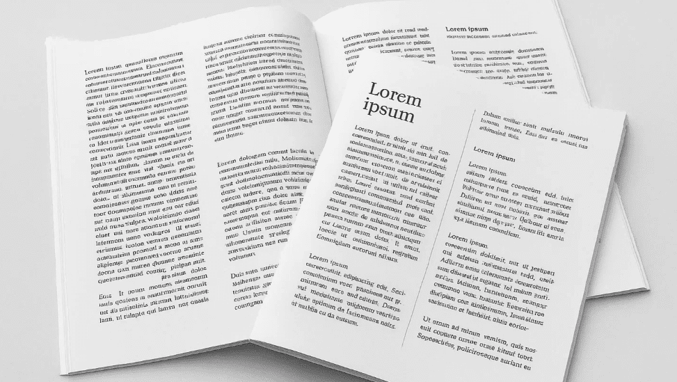
🔹 Left-Aligned / Ragged-Right Text
- Aligns with the left margin
- The right edge is uneven or “ragged”
- Default in most word processors and publishing tools
🔹 Fully Justified Text
- Aligns both left and right edges of the paragraph
- Spreads words out evenly across each line
- Common in books, newspapers, and formal documents
🧠 The Big Idea: It Depends on Context
Alignment is not about “right vs. wrong” — it’s about what fits your design, your content, and your audience. Let’s break it down.
📘 When to Use Left-Aligned Text
Left-aligned is:
- More casual and friendly
- Easier to read for most people
- Best for websites, brochures, newsletters, and flyers
- Less work for the designer — no rivers or awkward spacing to fix
✅ Best Use Cases:
- Educational content
- Blog posts
- Reports and manuals
- Email newsletters
✨ Pros:
- Natural word spacing
- Easier hyphenation control
- Cleaner readability, especially on screens
📙 When to Use Fully Justified Text
Justified text is:
- Neat and formal
- Ideal for printed books, newspapers, and magazines
- Packs more content into narrower spaces
✅ Best Use Cases:
- Novels and paperbacks
- Financial reports
- Newspapers and academic journals
⚠️ Be Careful Of:
- Rivers of white space (large gaps running vertically through paragraphs)
- Uneven word spacing or stretched letters
- Poor readability if line length isn’t optimized
Tip: Always turn on hyphenation when using justified text — it smooths out the spacing.
🧾 Real-Life Comparison
| Feature | Left-Aligned (Ragged-Right) | Fully Justified |
|---|---|---|
| Appearance | Casual, natural | Formal, structured |
| Readability | High, especially on screens | Medium (can vary with settings) |
| Word spacing | Consistent and natural | Variable; needs tuning |
| Ideal for | Web, flyers, newsletters | Books, newspapers, formal reports |
🛠️ Pro Tips for Designers
- Avoid long lines with justified text — it increases spacing issues.
- Use justified text only when your layout and font choice support it.
- Add subheadings and white space to break large blocks of justified text.
- In narrow columns, left-aligned usually works better than justified.
❓ Frequently Asked Questions
🔹 Does justified text save space?
Yes, to an extent. It allows more characters per line, which can reduce the number of lines and pages — especially in print.
🔹 Is left-aligned better for mobile screens?
Absolutely. Most responsive and web-friendly content uses left-aligned text for better readability on small screens.
🔹 Can I mix both in one document?
Yes! For example, use justified text for long body paragraphs and left-aligned for pull quotes, captions, and sidebars.


✅ The Bottom Line
There is no universal “best” alignment. It’s about what makes your content easier to read, supports your layout, and matches your message.
🎯 Use ragged-right for friendliness and ease.
🎯 Use justified for structure and polish — but tweak spacing carefully.
Your job as a designer is to choose what’s appropriate, not what’s popular.
🏷️ Tags:
desktop publishing, text alignment, justified text, typography rules, design readability, layout design
#Hashtags:
#DesktopPublishing #TextAlignment #TypographyTips #JustifiedText #DesignRules #PageLayout
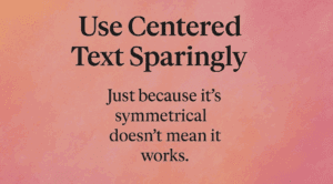
📖 Next Rule → Use Centered Text Sparingly


