This article is a part of “The 12 Golden Rules of Desktop Publishing Every Designer Should Know“
Imagine designing a beautifully laid-out magazine or brochure — only to fill it with straight quotes, hyphen overuse, and awkward ellipsis dots. Suddenly, your polished design starts looking… well, amateurish.
In desktop publishing, typographical punctuation is one of those fine details that separates good design from great design. It’s about replacing typing shortcuts with professional-quality punctuation marks — the ones real typesetters and publishers use.
Let’s dive into the punctuation marks you should be using, how to type them, and why they matter more than you might think.
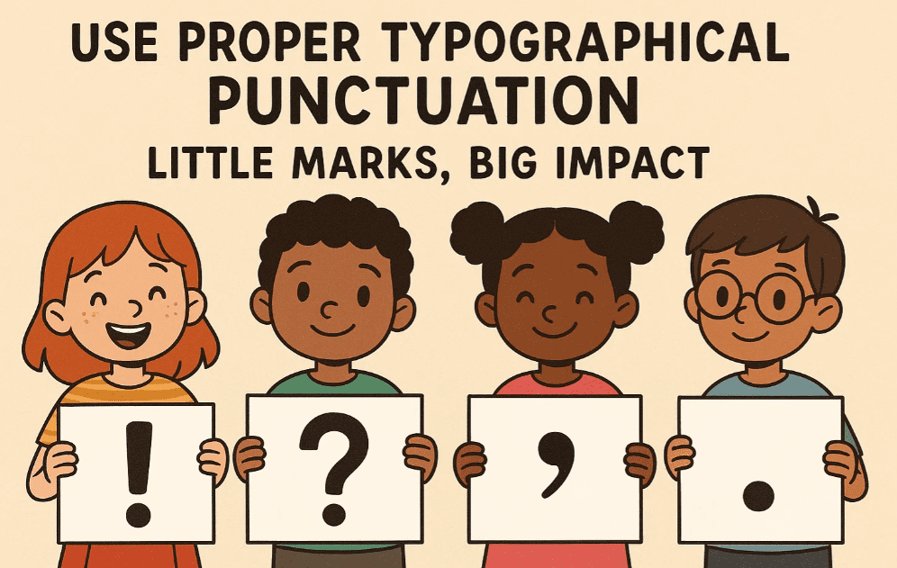
✍️ What Is Typographical Punctuation?
These are stylized punctuation marks used in professional typesetting. Unlike what you get from your keyboard’s default symbols, typographical marks are designed to blend seamlessly with the font and layout.
Common examples:
- “Curly” quotes vs. “straight” quotes
- En dashes (–) and Em dashes (—) vs. hyphens (-)
- Proper ellipses (…) vs. three dots (…)
These little changes can make your content look more refined, polished, and print-ready.
🧠 Why It Matters
✅ Professional Appearance
Typographer’s punctuation matches the font and its character style. It looks clean, consistent, and elegant — especially at large sizes like headlines or pull quotes.
✅ Better Readability
Proper punctuation guides the reader’s eye, adds natural rhythm, and improves the flow of your writing.
✅ Branding and Style Consistency
If you’re designing for a brand or publication, consistent punctuation reinforces their professional voice and attention to detail.
🔠 The Essential Typographical Characters You Should Use
1️⃣ Curly Quotes (Smart Quotes)
Correct: “This is a quote.”
Wrong: “This is a quote.”
Curly quotes, also known as smart quotes, curl inward and match the direction of the speech. Straight quotes look robotic and are a giveaway that the text was typed, not designed.


💡 How to Type:
- Most software like InDesign, Word, or Pages will automatically convert straight quotes to curly quotes.
- You can also type them manually using
AltorOptionkeys depending on your OS.
2️⃣ Apostrophes vs. Prime Symbols
Correct: 1990’s or I’m
Wrong: 1990”s or I”m
Straight apostrophes often get confused with prime marks, used for inches or minutes. Learn to spot and fix this.
3️⃣ En Dash (–)
Used for ranges (e.g., “pages 10–15” or “Monday–Friday”).
How to Type:
- Mac:
Option+- - Windows:
Alt+0150(on numeric keypad)
4️⃣ Em Dash (—)
Used to add breaks in thought or emphasis — like this.
How to Type:
- Mac:
Shift+Option+- - Windows:
Alt+0151
5️⃣ Ellipsis (…)
The proper ellipsis character is a single glyph, not three periods in a row.
How to Type:
- Mac:
Option+; - Windows:
Alt+0133
✅ Use ellipses to show omissions, pauses, or trailing thoughts.
🧰 Tips for Desktop Publishers
- In Adobe InDesign: Turn on smart punctuation in Preferences → Type → Use Typographer’s Quotes.
- In Microsoft Word: File → Options → Proofing → AutoCorrect → Replace straight quotes with smart quotes.
- Avoid mixing hyphens with en/em dashes — be intentional.
- Be especially careful with copy-pasting from emails or web pages — you might lose all smart punctuation.
🧾 Common Mistakes to Avoid
| Mistake | Use Instead |
|---|---|
| “Straight quotes” | “Curly quotes” |
| Three periods (…) | Proper ellipsis (…) |
| Hyphen for ranges (3-5) | En dash (3–5) |
| Hyphen for breaks — like this | Em dash — like this |
| Inch marks (5″) in dialogue | Proper quotation marks (“5”) |
❓ Frequently Asked Questions
🔹 Is this important for web content too?
For high-quality branding sites or blogs — yes. However, for general web content, straight quotes and hyphens may be acceptable depending on the platform or CMS.
🔹 Does using correct punctuation improve SEO?
Not directly, but better formatting increases readability and professionalism, which can reduce bounce rates and improve engagement.
🔹 Will fonts automatically adjust punctuation?
Some high-end fonts include stylized quotation marks and dashes. But you still need to use the correct character, or the font’s features won’t help.
✅ The Bottom Line
Professional-looking design is about details — and punctuation is one of those hidden elements that sets great typography apart. Using typographical punctuation doesn’t just look better — it feels better to read.
🎯 Treat your quotes, dashes, and dots like design elements.
🎯 They’re small, but they speak volumes about your professionalism.
🏷️ Tags:
typography, desktop publishing, punctuation, smart quotes, en dash, em dash, curly quotes, design principles
#Hashtags:
#DesktopPublishing #TypographyTips #DesignDetails #CurlyQuotes #SmartPunctuation #GraphicDesign
📖 Next Rule → Use Frames, Boxes, Borders with a Purpose


