This article is a part of “The 12 Golden Rules of Desktop Publishing Every Designer Should Know“
In design, white space isn’t wasted space — it’s breathing space. It’s what gives your content clarity, balance, and elegance. But for many new desktop publishers, white space feels like a missed opportunity. “Shouldn’t we fill every inch of the page?”

Absolutely not.
Let’s explore how mastering white space can transform your layouts, improve readability, and elevate your design from cluttered to clean.
🧠 What Is White Space?
White space (also known as negative space) is the portion of a layout that is left empty — the space between text blocks, around images, in margins, and even between lines and letters.
It doesn’t have to be white — it just means unused or intentionally unfilled space in the design.
🎯 Why White Space Matters
✅ Improves Readability
Readers absorb content more easily when it’s not crammed together. White space separates ideas and prevents visual fatigue.
✅ Creates Focus
The more space around an object, the more attention it draws. Want your CTA or headline to pop? Surround it with air.
✅ Adds Elegance and Sophistication
Luxury brands often use generous white space to convey status, simplicity, and confidence.
✅ Enhances Layout Hierarchy
It helps establish the flow of content — what to read first, what’s most important, and how to navigate a page.
🔍 Common Signs You Need More White Space
- Your layout feels crowded or overwhelming
- Readers are skipping content
- You’re shrinking font sizes just to “fit it all in”
- Every visual element is boxed or separated with a border
If this sounds familiar — white space is your solution.


🧰 How to Add White Space Effectively
Here are some powerful ways to introduce breathing room into your design:
1️⃣ Increase Margins and Padding
Wider margins around the page instantly make a layout feel less tight.
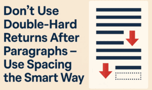
2️⃣ Adjust Paragraph Spacing
Instead of just line breaks, add 6–12pt of space after each paragraph using paragraph styles.
3️⃣ Use Line Height (Leading)
A little extra vertical space between lines of text can make long paragraphs feel less dense.
4️⃣ Add Whitespace Around Headlines
Separate titles from the body with more spacing above and below — it gives each section a stronger presence.
5️⃣ Space Out Images and Text
Avoid hugging images with words. Leave a gap (called standoff space) so that graphics and text don’t compete.
6️⃣ Use Columns Instead of Full-Width Text
Multi-column layouts reduce line length and allow more room for margins and gutters.
📋 Design Tips for White Space
| Area | Tip |
|---|---|
| Body Text | Use 120–145% line spacing (leading) |
| Between Paragraphs | Use paragraph spacing, not double enters |
| Headline-to-Body Gap | Leave at least twice the body line height |
| Between Columns | 0.25–0.5 inches minimum gutter space |
| Around Images | Leave generous margins or standoff space |
❌ Mistakes to Avoid
- Cramping text to fit on one page — it hurts readability
- Too much white space without hierarchy — it creates confusion
- Trapped space — like floating gaps in between boxed content
- Overuse of centered text with lots of space can feel disconnected rather than elegant
✨ Pro Designer Tip
Want to create a premium, upscale look?
Use white space as a design element.
Let the “less” say more. When paired with good typography, even minimal content feels more impactful when spaced out well.
❓ Frequently Asked Questions
🔹 Isn’t white space just wasted space?
Not at all. It improves readability, increases comprehension, and makes your message more effective.
🔹 How much white space is ideal?
There’s no fixed percentage — but if your layout looks crowded, increase spacing. On average, about 30–50% of your page should be white space.
🔹 Does white space work on web pages too?
Absolutely. In fact, websites with generous white space often have lower bounce rates and better UX.
✅ The Bottom Line
White space isn’t empty — it’s intentionally unfilled. It brings calm, balance, and visual order to your design.
🎯 If your layout feels noisy, don’t add more — take something away.
🎯 When in doubt, space it out.
Less clutter = more clarity.
🏷️ Tags:
white space in design, layout design, readability tips, desktop publishing, visual hierarchy, typography
#Hashtags:
#DesktopPublishing #WhiteSpaceMatters #DesignTips #MinimalistDesign #TypographyRules #GraphicDesign
📖 Next Rule → Reset Software Document Defaults


