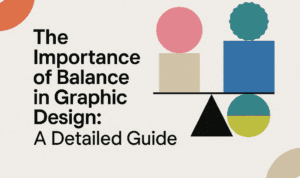
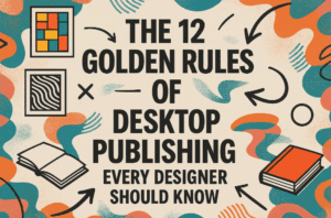
This article is a part of “The 12 Golden Rules of Desktop Publishing Every Designer Should Know“
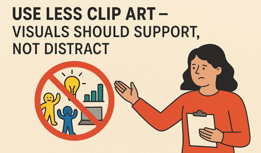
Clip art can be charming, quirky, and even nostalgic — but when overused or misused, it can ruin your design faster than a Comic Sans headline.
There was a time when clip art felt like the go-to tool for making documents “fun” or “eye-catching.” But in today’s world of modern design, where minimalism and intentionality reign, less truly is more.
Let’s dive into how to use clip art wisely — and when to leave it out altogether.
🧠 Why Too Much Clip Art Is a Problem
Clip art was originally designed to help people add quick visual appeal to newsletters, posters, and slides. But because it’s so easy to drag and drop, many layouts ended up looking like sticker albums — cluttered and chaotic.
Here’s why that’s a problem:
- ❌ Distracts from the message
- ❌ Slows down reading
- ❌ Reduces professionalism
- ❌ Competes with the content
Instead of enhancing the message, too many images create visual noise that dilutes what you’re trying to say.
🎯 When and How to Use Clip Art Wisely
✅ 1. Use One or Two Strong Visuals
A single relevant image is often more effective than five random icons. Choose one high-quality clip art or illustration that directly supports your message.
✅ 2. Use a Consistent Style
Mixing cartoon clip art with photo-realistic icons? Don’t. Stick to one visual language — whether it’s flat icons, hand-drawn, or vector-style.
✅ 3. Make Sure It Matches the Tone
A goofy stick figure might work for a kid’s birthday invitation — but not a business report or academic document.
✅ 4. Treat Visuals as Part of the Layout
Align images with the text, maintain consistent margins, and make sure graphics don’t “float” awkwardly on the page.


📋 Good vs. Bad Examples
| Use Case | Bad Example | Good Example |
|---|---|---|
| Party Flyer | Balloons, hats, cake, confetti, gifts | One large cake icon + bold headline |
| School Newsletter | Random school icons everywhere | One clean icon at the header |
| Business Report | Clip art handshake + money + graphs | One icon or visual summary chart |
| Poster for Charity Event | Doodles, hearts, animals, hands | One simple heart or themed icon |
💡 Alternatives to Clip Art
Not every visual needs to be clip art. Consider using:
- Modern icons from design libraries (e.g., Flaticon, The Noun Project)
- Photographs (real-world photos often add more credibility)
- Infographics or charts
- Custom illustrations or branded graphics
- Font-based icons (like Font Awesome)
These alternatives often look more polished and professional, especially for business and editorial design.
🧰 Pro Design Tips
- ✅ Keep image counts under 3 per page (unless you’re creating a catalog or gallery).
- ✅ Resize and align images consistently.
- ✅ Leave white space around your images — don’t cram visuals between text blocks.
- ✅ Use transparency or SVG format when possible to avoid white boxy backgrounds.
- ✅ Don’t use the same clip art everyone else is using — it feels generic.
❓ Frequently Asked Questions
🔹 Is clip art still okay to use in 2025?
Yes — when used with restraint. Modern clip art sets are much better designed than old Word Art packs. Just be intentional and avoid default or outdated styles.
🔹 Where can I find high-quality clip art?
Try these:
- Undraw.co
- Icons8
- Blush.design
- Open Peeps
These sites offer modern, scalable illustrations that beat old-school clip art.
🔹 How do I make clip art look more modern?
Pair it with a clean font, apply your brand colors, and place it with intention. Or replace it entirely with a custom illustration or icon.
✅ The Bottom Line
Clip art is a tool — not a decoration. If it’s not adding value, it’s adding clutter.
🎯 Ask yourself before adding an image:
“Does this help the reader understand, or is it just filling space?”
Let your visuals serve the story — not distract from it.
🏷️ Tags:
desktop publishing, clip art, visual design, design clutter, infographic design, layout tips
#Hashtags:
#DesktopPublishing #DesignTips #ClipArtUse #VisualHierarchy #GraphicDesign #MinimalistDesign
📖 Next Rule → Use More White Space


