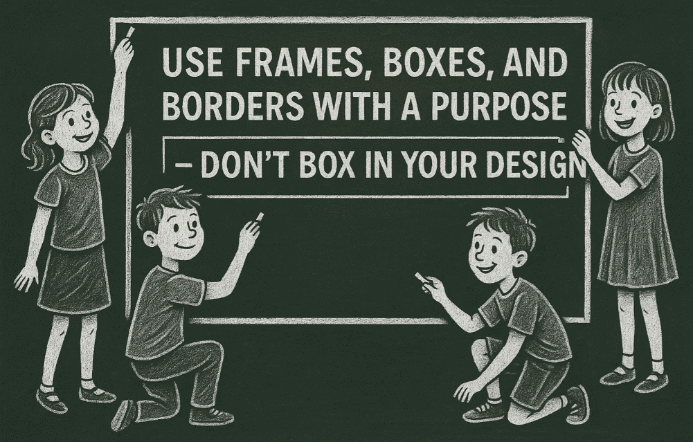
This article is a part of “The 12 Golden Rules of Desktop Publishing Every Designer Should Know“
Ever seen a flyer where everything is in a box? Maybe even boxes within boxes? It might look like someone had fun with layout tools — but to the reader, it’s visually exhausting.
Frames, borders, and boxes are powerful design tools, but only when used with intention and restraint. Done right, they can highlight key points and improve structure. Done wrong, they clutter your page and confuse the message.
Let’s explore how to use frames the smart way.
🧠 The Psychology of Framing
Frames and borders draw attention. They act like visual stop signs, telling the reader, “Hey, this part is important!”
But too many stop signs? People stop reading.
Think of frames as highlighters for your layout — use them to:
- Emphasize
- Separate
- Group
- Decorate
If you can’t answer why a text box is there, it probably doesn’t need to be.
🧾 Smart Use Cases for Frames and Boxes
✅ Use frames to:
- Set apart fine print or footnotes
A thin border can guide the eye to disclaimers, copyright info, or supplementary details. - Highlight key tips or quotes
Pull quotes in a sidebar box improve scan-ability and give structure. - Group related content or images
Especially helpful in multi-column layouts or brochures to visually organize ideas. - Enhance visual appeal on minimal designs
A single frame around a centered heading can make a statement on its own.
❌ Common Mistakes to Avoid
| Mistake | Better Alternative |
|---|---|
| Multiple stacked boxes | Use spacing or typography to separate |
| Box around every paragraph | Use headers, line breaks, or shading |
| Heavy lines for subtle content | Use light gray or hairline borders |
| Different border styles per page | Stick to one consistent style |
🎨 Types of Frames and When to Use Them
🟩 Simple Line Frames
Use thin lines to subtly contain or highlight information. Ideal for professional and clean layouts like resumes or formal reports.
🎁 Decorative Borders
Use sparingly for fun designs like invitations, kids’ party flyers, or holiday cards. Match the border style to the mood of the content.
🖼 Image or Content Frames
Frame photos or infographics to separate them from text, especially in crowded layouts.


🧾 Dotted Lines
Commonly used for coupons or “tear-away” callouts in print ads. They give a “cut me out” feel.
🟥 Color Blocks as Frames
Background-color blocks can act as visual frames without lines. Great for modern layouts or web banners.
🧰 Designer Pro Tips
- Be consistent: Pick one frame style (line weight, color, radius) and use it across your entire design.
- Use padding: Always leave space between your content and the frame edge (known as “standoff” or “inset spacing”).
- Let frames breathe: Don’t cram content tightly inside. Frames should enhance readability — not create tension.
- Avoid boxing lists: Bulleted or numbered lists are already structured. Frames can overcomplicate them.
💡 Alternative Techniques (Instead of Frames)
Not everything needs a box! Try these subtle ways to set content apart:
- Font weight changes (bold for emphasis)
- Background shading
- Increased line spacing or paragraph spacing
- Indentation or margins
- Icons or bullets
- Divider lines
These techniques often work better and keep your layout airy and modern.
❓ Frequently Asked Questions
🔹 Should every design use at least one frame?
No. Some of the cleanest, most modern designs don’t use any borders or boxes — they rely on white space, color, and font hierarchy.
🔹 What about newsletters or magazines?
A few well-placed frames can help structure a busy layout. But resist the urge to overuse — structure can also come from alignment and spacing.
🔹 Can I use colored borders?
Yes! But keep contrast in mind. A light gray or brand-color border is more subtle than black — and usually more elegant.
✅ The Bottom Line
Frames, boxes, and borders are tools, not decoration. Use them when they add value — not just because they’re easy to insert.
🎯 Every frame should have a purpose: guide the eye, group content, or create visual interest.
🎯 If you’re using more than three boxes on a page, ask yourself: can I achieve this look with spacing instead?
Great design isn’t boxed in — it’s intentional, readable, and balanced.
🏷️ Tags:
desktop publishing, frames and borders, design layout, typography, visual hierarchy, layout design
#Hashtags:
#DesktopPublishing #LayoutDesign #DesignTips #FramesAndBorders #GraphicDesign #VisualHierarchy
📖 Next Rule → Use Less Clip Art


