This article is a part of “The 12 Golden Rules of Desktop Publishing Every Designer Should Know“
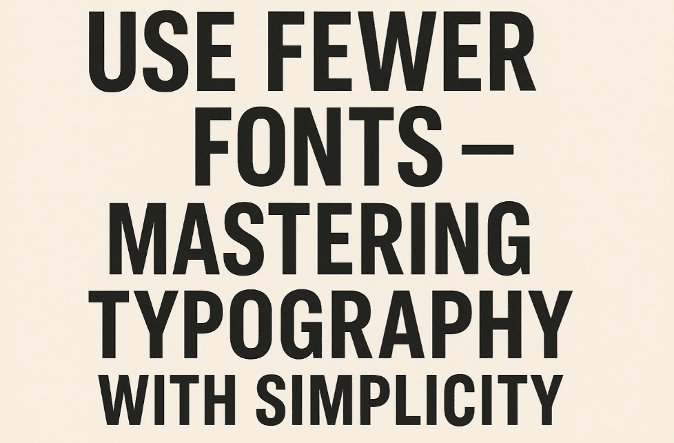
If your design looks chaotic and cluttered, there’s a good chance it’s suffering from font overload. In desktop publishing, knowing how many fonts to use — and how to pair them — can instantly elevate your work from amateur to professional.
The rule here is simple but powerful: Less is more. Good typography isn’t about cramming in fancy fonts — it’s about clear hierarchy, consistency, and letting the message shine.
🎨 Why Font Count Matters
When every heading, paragraph, and caption has a different typeface, the reader doesn’t know where to look. It creates visual confusion and distracts from the message.
Too many fonts:
- Make your layout feel disorganized
- Break consistency across your document
- Can overwhelm your readers visually
- Look less professional and more “DIY flyer from 2002”
✅ How Many Fonts Should You Use?
A good rule of thumb:
👉 Stick to two or three fonts per project.
That’s enough to establish visual contrast and text hierarchy without making things look chaotic.
Suggested font usage:
- 1 font for body text (e.g., Lato, Times New Roman)
- 1 font for headings (e.g., Montserrat, Georgia)
- 1 optional accent font (for pull quotes, callouts, captions)
📌 Bonus Tip: Instead of using 4 different fonts, use variations of the same one — bold, italic, small caps, and different sizes.
📋 What Happens When You Use Too Many Fonts?
Imagine reading a newsletter where the main headline is in Comic Sans, subheadings in Papyrus, body text in Arial, and captions in Jokerman. 😬
You don’t know where to focus, and the whole thing starts to look more like a ransom note than a professional publication.
Example Comparison:
| Font Use | Result |
|---|---|
| 2-3 Consistent Fonts | Clean, professional, easy to read |
| 5+ Mixed Fonts | Confusing, messy, visually overwhelming |
🧠 Font Pairing Tips for Beginners
Choosing fonts that work well together is an art. Here are a few safe combos to get started:
| Heading Font | Body Font |
|---|---|
| Montserrat (sans) | Lora (serif) |
| Playfair Display | Open Sans |
| Raleway | Roboto |
| Bebas Neue | Source Sans Pro |
| Merriweather (serif) | Merriweather Sans |
✅ Pro Tip: Combine a serif with a sans-serif for visual contrast, but avoid pairing two fonts that are too similar — they clash subtly.
✍️ Pull Quotes, Sidebars, and Page Numbers
You might be tempted to use a unique font for every little element. Resist the urge.
- Use bold/italic variants of your existing fonts.
- For page numbers or sidebars, use the body font in small caps or with slight color contrast.
- For pull quotes, consider the heading font at a slightly larger size.
Keep it cohesive. Keep it elegant.
❓ Frequently Asked Questions
🔹 Can I ever use more than 4 fonts?
Yes — in large, multi-section publications like magazines or books. But even then, use them sparingly and with purpose.
🔹 Should I avoid decorative fonts completely?
Not at all. Just use them selectively — for title designs, invitations, or specific graphics. Never for body text.
🔹 What if a client demands a “creative” look with lots of fonts?
Educate them gently: Too many fonts can hurt readability. Offer them options that still feel creative but use font variation within a cohesive family.
✅ The Bottom Line
Using fewer fonts isn’t about limiting your creativity — it’s about enhancing your message. Let your fonts guide the reader’s eye, not confuse them. Make every font choice intentional.
🎯 Two or three well-chosen fonts > five mismatched ones.
🏷️ Tags:
desktop publishing, typography, font pairing, font tips, design principles, graphic design
#Hashtags:
#DesktopPublishing #TypographyTips #FontPairing #DesignRules #LessIsMore #GraphicDesignTips
📖 Next Rule → Use Ragged-Right or Fully Justified Text Appropriately


