This article is a part of “The 12 Golden Rules of Desktop Publishing Every Designer Should Know“
Let’s be honest — centered text looks elegant at first glance. It’s symmetrical, formal, and feels… balanced. So why not use it everywhere?
Because when it comes to desktop publishing, centered text is one of those design elements that’s easy to misuse. Used carefully, it can add visual harmony. Used too often, it can ruin readability and structure.
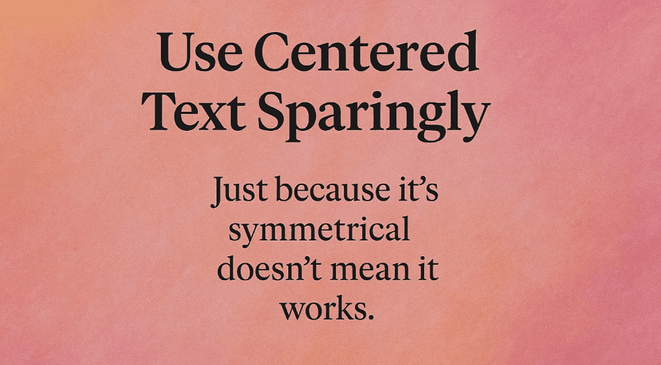
Let’s uncover when centered text helps, when it hurts, and how to use it the smart way.
🧐 What Is Centered Text?
Centered text means each line of text is positioned equally between the left and right margins. The starting point of every line varies — which forces the reader to scan and find where each new line begins.
While that may not sound like a big deal, it adds cognitive friction — especially in long paragraphs.
🎯 When to Use Centered Text
Yes, centered text has its place — but only when used with purpose and moderation.
✅ Ideal Use Cases:
- Wedding invitations
- Greeting cards
- Certificates and plaques
- Poetic verses or song lyrics
- Short headlines or section titles
These are situations where:
- The text is brief
- You want a formal or artistic tone
- Layout structure is minimal
❌ When Not to Use Centered Text
Avoid centered alignment in:
- Body text or long paragraphs
- Newsletters and brochures
- Articles, reports, and books
- Lists or bullet points
Why? Because:
- It’s harder to read
- The eye has to search for the start of each new line
- It disrupts the flow of content and looks inconsistent in multi-column layouts
📌 Example: Ever seen an email where the body paragraph is centered? It feels off — maybe even a little amateurish.
📋 Real-Life Comparison
| Feature | Centered Text | Left-Aligned Text (Ragged Right) |
|---|---|---|
| Readability | Low (especially in long form) | High |
| Use in body paragraphs | Avoid | Recommended |
| Use in short headings | Acceptable | Also great |
| Visual tone | Formal, poetic, delicate | Practical, professional, friendly |
🧠 Design Pro Tips
- Center short text only — never more than 2–3 lines.
- Avoid centering bulleted or numbered lists — it kills scan-ability.
- Combine centered titles with left-aligned body text for contrast and flow.
- If centering a headline, add extra leading (line spacing) for balance.
- Use centered text over justified body content if you need a formal, clean header.
🎨 Centered Doesn’t Mean Boring — Add Style Wisely
If you’re going to use centered text, consider enhancing it with:
- Decorative borders (e.g., certificates)
- Drop caps or initial caps for emphasis
- Italicized quotes or verses
- Extra white space around it to give it breathing room
Think of it as a visual decoration — not the main event.
❓ Frequently Asked Questions
🔹 Why is centered text harder to read?
Because your eye no longer has a fixed starting point for each line. It disrupts the natural reading flow, especially in large text blocks.
🔹 Can I use centered text in mobile or responsive design?
Use with caution. Mobile devices often make centered text look awkward or cramped. Left-aligned text is safer and more readable on small screens.
🔹 What about headlines?
Short centered headlines are okay, especially if they’re meant to be decorative or dramatic. Just make sure they’re balanced with plenty of white space.
✅ The Bottom Line
Centered text is beautiful when used thoughtfully. But when used carelessly, it creates confusion, inconsistency, and eye strain.
🎯 Use centered text for style — not structure.
🎯 Keep it short, clean, and spaced well.
🎯 For most body content, stick to left alignment.
Good design is about clarity. Let your readers focus on your message — not fight to find the next line.
🏷️ Tags:
desktop publishing, typography, centered text, text alignment, formatting tips, readability
#Hashtags:
#DesktopPublishing #TextAlignment #TypographyRules #DesignTips #CenteredText #PageLayout
📖 Next Rule → Balance Line Length with Type Size


