This article is a part of “The 12 Golden Rules of Desktop Publishing Every Designer Should Know“
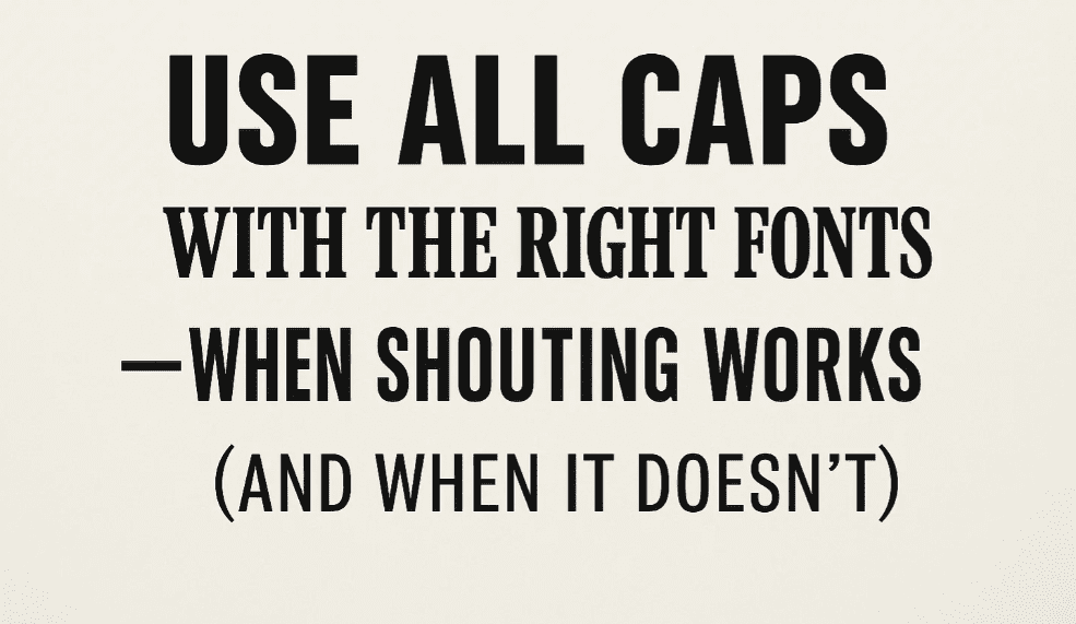
YOU’VE SEEN TEXT LIKE THIS, RIGHT?
IT FEELS LIKE SOMEONE’S YELLING AT YOU.
That’s the power — and the danger — of using ALL CAPS. While uppercase letters can add emphasis, impact, and structure, they can also reduce readability, create visual noise, and, in the digital world, unintentionally shout at your readers.
In desktop publishing, using all caps is more than just a formatting decision. It’s a stylistic choice that needs to be backed by smart font selection and layout planning.
🧠 Why All Caps Are So Tricky
Capital letters are uniform in height, which removes the variation our eyes rely on to recognize words quickly. Mixed-case words (with ascenders and descenders) are easier to scan and read.
All caps:
- Take up more horizontal space
- Reduce legibility in long passages
- Can come across as aggressive or loud
That said, when used correctly, all caps can give your design:
- Authority (e.g., newspaper headers)
- Elegance (e.g., wedding invites in small caps)
- Consistency (e.g., acronyms or labels)
🎯 When to Use All Caps
✅ Use sparingly and purposefully, such as:
- Short headlines
- Navigation menus
- Section titles or labels
- Acronyms (NASA, PDF, HTML)
- Visual elements (e.g., newsletter nameplates)
🔔 Important: Keep it short. All caps works best with fewer than 5 words, and ideally, under 20 characters.
❌ When to Avoid All Caps
🚫 Do not use all caps for:
- Body text
- Long headlines or paragraphs
- Script or decorative fonts
- Heavy serif fonts with swashes
All caps in the wrong font — or in bulk — makes the text hard to read, especially on screens or small print formats.


🧵 Font Pairing Tips for All Caps
Not every font looks good in all caps. Here’s what works well:
✅ Best Fonts for All Caps:
- Sans-serif fonts: Helvetica, Futura, Montserrat, Bebas Neue
- Geometric or condensed fonts: Raleway, Gotham, Oswald
- Titling fonts: Designed specifically to look good in uppercase
- Slab serifs: Rockwell, Museo Slab (sparingly)
❌ Fonts to Avoid:
- Script fonts (e.g., Brush Script, Pacifico)
- Highly decorative fonts (e.g., Curlz, Jokerman)
- Fonts with dramatic serifs or swashes
🧰 Designer Pro Tips
- Use letter spacing (tracking): All caps often benefits from a little extra space between letters — try +20 to +50 tracking.
- Use small caps instead of full caps if you want a refined, elegant look.
- Avoid combining all caps and bold in large amounts — it becomes overwhelming.
- Be consistent: If you use all caps for section headings, use it the same way throughout the document.
🧾 Real-World Examples
| Use Case | Font Type | All Caps OK? |
|---|---|---|
| Newsletter Title | Sans-serif (Bebas) | ✅ Yes |
| Certificate Text | Small Caps Serif | ✅ Yes |
| Blog Body Text | Serif (Times New) | ❌ No |
| Acronym (e.g., NASA) | Any readable font | ✅ Yes |
| Paragraph in Script Font | Brush Script | ❌ Never |
❓ Frequently Asked Questions
🔹 Is it okay to use all caps in email or online?
In casual or professional settings, all caps in email can feel like shouting. Use it very sparingly for buttons, labels, or navigation — not full sentences.
🔹 What’s the difference between all caps and small caps?
All caps turns every letter into an uppercase letter. Small caps use uppercase-shaped letters that are the height of lowercase letters. Small caps are more elegant and easier to read.
🔹 Can I use all caps for social media designs?
Yes — especially for attention-grabbing headers in thumbnails or ads. Just remember: less is more.
✅ The Bottom Line
All caps can be bold, confident, and impactful — if used the right way. The trick is in limiting the scope, choosing the right font, and spacing it just right.
🎯 Think of all caps like spice — add just enough to bring flavor to your layout, but don’t overdo it.
🏷️ Tags:
desktop publishing, all caps, font selection, typography, readability, design rules
#Hashtags:
#DesktopPublishing #TypographyTips #AllCapsDesign #ReadabilityMatters #GraphicDesign #FontUsage
📖 Next Rule → Use Proper Typographical Punctuation


