Typography is a fundamental principle in graphic design that you can never ignore. Whether you’re designing for a brand, a product, or personal projects, the right typography can make or break your design.
In this article, we’ll explore:
✔ Why typography is crucial in design
✔ The four key emotional categories of typography
✔ How to choose the right fonts for each category
Why Typography Matters in Graphic Design
Typography transforms a simple image or photograph into a complete design. For example:
- A plain photo becomes a poster when text is added.
- A product image turns into an advertisement with the right typography.
Without typography, your design remains just an art piece—not a functional graphic.
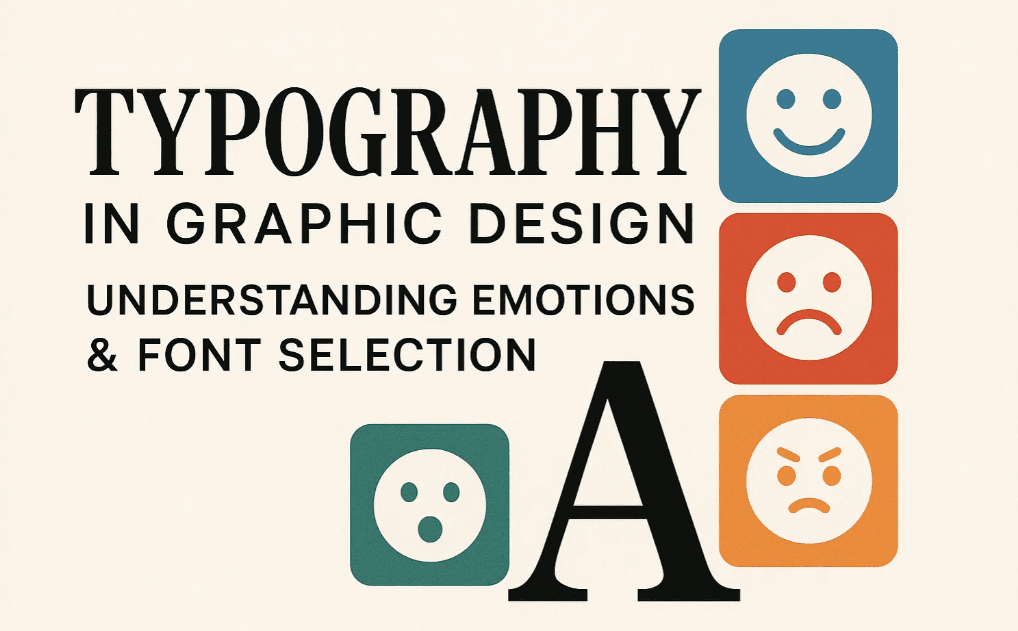
The Four Emotional Categories of Typography
Every design falls into one of these four emotional categories:
- Strong & Bold
- Luxury & Elegant
- Modern
- Cool & Playful
Understanding these categories helps you select the right fonts effortlessly.
1. Strong & Bold Typography
Use Case:
- Gym brands
- Protein supplements
- Leather products
Font Style: Sans-serif bold fonts (e.g., Impact, Bebas Neue, Helvetica Bold).
Example:
- Protein powder ads use thick, bold fonts to convey strength.
- Shoe advertisements rely on strong typography for impact.
2. Luxury & Elegant Typography
Use Case:
- Jewelry brands
- High-end fashion
- Premium cosmetics
Font Style: Serif & script fonts (e.g., Times New Roman, Playfair Display, Didot).


Example:
- Luxury watch ads use elegant serif fonts.
- High-fashion posters feature sophisticated scripts.
3. Modern Typography
Use Case:
- Tech startups
- Minimalist brands
- Contemporary designs
Font Style: Clean sans-serif & geometric fonts (e.g., Futura, Montserrat, Avenir).
Example:
- Apple’s product designs use sleek, modern fonts.
- Digital agency websites prefer minimalist typography.
4. Cool & Playful Typography
Use Case:
- Youth brands
- Seasonal sales (e.g., winter collections)
- Fun & casual products
Font Style: Script & decorative fonts (e.g., Lobster, Pacifico, Brush Script).
Example:
- Summer sale posters use bold, playful fonts.
- Winter holiday ads feature handwritten scripts.
How to Choose the Right Font for Your Design?
- Identify the Emotion – Is your design strong, elegant, modern, or playful?
- Match the Font – Use the recommended font styles for each category.
- Test & Adjust – Ensure readability and visual harmony.
Pro Tip:
- Strong designs = Bold, heavy fonts
- Luxury designs = Serif & script fonts
- Modern designs = Clean sans-serif fonts
- Cool designs = Script & decorative fonts
FAQs on Typography in Design
Q1. Can I mix different font styles?
A: Yes, but limit to 2-3 fonts max (e.g., one bold + one elegant). Too many fonts create clutter.
Q2. How do I know which category my design falls into?
A: Ask yourself:
- Is the message strong & powerful? → Strong category
- Is it luxury & premium? → Elegant category
- Is it minimal & trendy? → Modern category
- Is it fun & casual? → Cool category
Q3. Where can I download free fonts?
A: Check out:
Final Verdict: Mastering Typography
Typography is not just about fonts—it’s about emotion & communication. By understanding the four key categories, you can:
✔ Enhance brand messaging
✔ Improve design consistency
✔ Create visually appealing graphics
Next Step:
- Experiment with different font styles.
- Analyze real-world ads for inspiration.
- Stay tuned for our next guide on color psychology in design!
Tags
Typography, Graphic Design, Font Selection, Design Principles, Branding, Advertising
Hashtags
Typography #GraphicDesign #Fonts #DesignTips #BrandIdentity #CreativeDesign
Disclaimer: All images used are for illustrative purposes only. Always ensure proper licensing for fonts and images in commercial projects.
🔗 Explore More Fonts: Google Fonts | Adobe Fonts
Would you like a detailed guide on color psychology next? Let us know in the comments! 🎨


