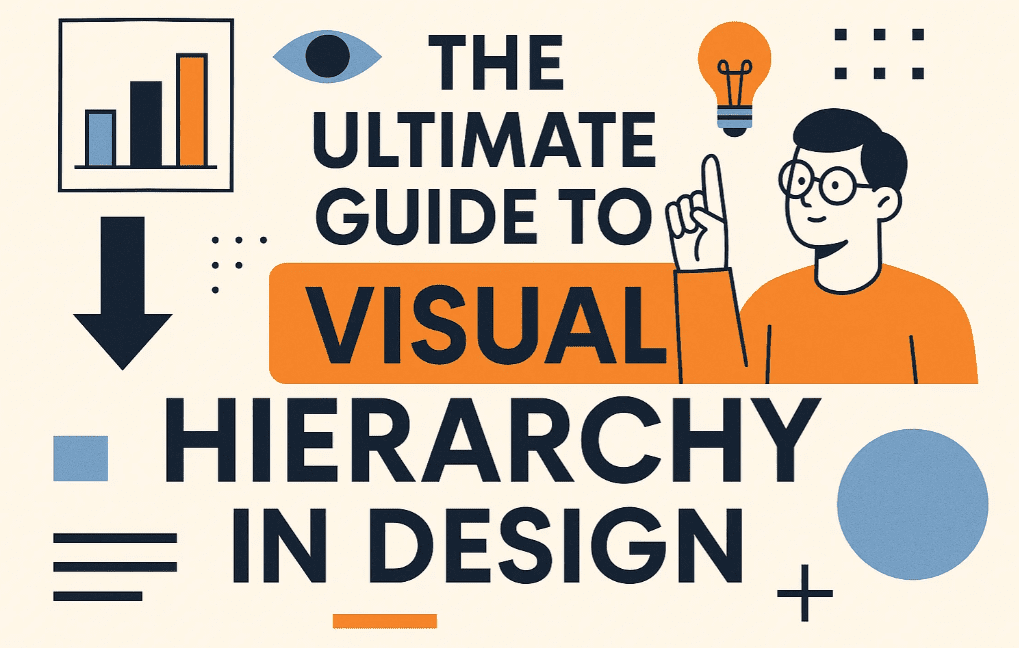
Visual hierarchy is the secret weapon behind every effective design—it guides the viewer’s eye, communicates importance, and makes your message impossible to ignore. Whether you’re designing websites, posters, or social media graphics, mastering visual hierarchy ensures your work looks professional and persuasive.
In this guide, you’ll learn:
✔ What visual hierarchy is (and why it’s critical)
✔ The 8 principles of visual hierarchy
✔ How to apply hierarchy to different mediums (web, print, social)
✔ Real-world examples of effective hierarchy
✔ Common mistakes to avoid
1. What is Visual Hierarchy?
Visual hierarchy is the arrangement of elements in a design to show their order of importance. It answers:
- What should viewers see first?
- What should they see next?
- What’s the flow of information?
Example:
- Headline (Largest, boldest) → Subhead (Medium) → Body text (Smallest)
2. The 8 Principles of Visual Hierarchy
1. Size = Importance
- Larger elements grab attention first.
- Use for: Headlines, CTAs, key visuals.
2. Color & Contrast
- Bright colors stand out; muted colors recede.
- Pro tip: Use one accent color for CTAs (e.g., red “Buy Now” button).
3. Typography
- Hierarchy formula:
- Heading (Bold, large) → Subheading (Medium) → Body (Small, readable).
- Avoid: More than 3 fonts in one design.
4. Spacing & Grouping
- Related items should be close together (Gestalt Principle).
- Example:
- Good: Menu items grouped → Easy navigation.
- Bad: Scattered elements → Confusion.
5. Alignment & Grids
- Grids create order and professionalism.
- Tools:
- Adobe XD/Figma (for digital)
- Modular grids (for print)
6. Texture & Style
- Textured/3D elements pop more than flat ones.
- Example:
- A raised button looks clickable vs. a flat shape.
7. Repetition & Patterns
- Repeating styles (e.g., same button design) = Consistency.
- Branding bonus: Repeat logos, colors, fonts.
8. Motion & Animation (Digital Only)
- Moving elements dominate attention.
- Use sparingly: Animated CTAs, loading bars.
3. Visual Hierarchy by Medium
A. Websites
- Hero section (Biggest text + image).
- Navigation menu (Clear, contrasting).
- CTAs (Bright buttons like “Sign Up”).
- Footer (Smaller text, less priority).
Example:
- Apple.com → Giant product image → Short headline → CTA button.
B. Social Media Graphics
- Primary text (20% of space).
- Secondary text (10-15%).
- Hashtags/links (Smallest, bottom).
Example:
- Instagram ads: Bold headline → Product image → Small disclaimer text.
C. Print (Posters, Flyers)
- Headline (Top/middle, huge).
- Subtext (Supporting details).
- Fine print (Tiny, bottom).
Example:
- Movie posters: Title → Star actors → Release date.
4. Real-World Examples
| Design | Hierarchy Trick | Why It Works |
|---|---|---|
| Spotify Playlist Cover | Title (BIG) → Artist (small) | Instantly recognizable. |
| Nike Ad | Shoe (largest) → Slogan (medium) → CTA (bold) | Focus on product first. |
| The New Yorker | Bold headline → Illustration → Small body text | Classic editorial hierarchy. |
5. Common Mistakes
❌ Everything is bold/large → No focal point.
❌ Poor contrast → Text blends into background.
❌ Ignoring natural eye flow (Top → Bottom, Left → Right).
❌ Cluttered spacing → Overwhelms viewers.
FAQs
Q1. How do I test if my hierarchy works?
A: Use the 5-second test: Show someone your design for 5 secs → Ask what they remember first.
Q2. What’s the best tool for hierarchy mockups?
A: Figma (free), Adobe XD, or Canva (for beginners).
Q3. How does hierarchy affect conversions?
A: Good hierarchy = +30-50% more engagement (NN Group study).


Key Takeaways
✅ Bigger = More important (Size dominates).
✅ Group related items (Gestalt Principle).
✅ Limit fonts/colors to avoid chaos.
✅ Align to grids for clean layouts.
Free Tools to Practice:
Now it’s your turn! Share a design (or link) in the comments—we’ll analyze its hierarchy!
Tags
Visual Hierarchy, Graphic Design, UX Design, Layout Design, Composition
Hashtags
#VisualHierarchy #DesignTips #UXDesign #GraphicDesign #LayoutDesign #Composition
Next Up: Want a step-by-step branding guide? Let us know! 🚀