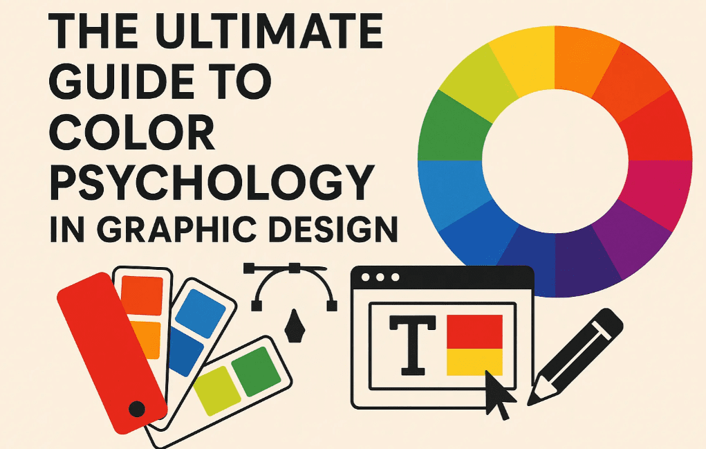
Colors influence emotions, perceptions, and decision-making—making them one of the most powerful tools in graphic design, branding, and marketing. Understanding color psychology helps designers create visuals that evoke the right emotions and drive engagement.
In this guide, we’ll explore:
✔ What is color psychology?
✔ The emotional impact of different colors
✔ How to choose the right color palette for branding
✔ Real-world examples of color psychology in design
✔ Common mistakes to avoid
What is Color Psychology?
Color psychology studies how colors affect human emotions, behaviors, and perceptions. Different colors trigger different psychological responses, which designers and marketers leverage to:
- Enhance brand identity
- Improve user experience (UX)
- Increase conversions
- Communicate messages effectively
The Emotional Impact of Colors
1. Red – Energy, Passion, Urgency
- Positive Associations: Love, excitement, power.
- Negative Associations: Danger, aggression.
- Best For: Food brands (McDonald’s, Coca-Cola), sales (discounts), call-to-action buttons.
2. Blue – Trust, Calm, Professionalism
- Positive Associations: Security, reliability, peace.
- Negative Associations: Coldness, sadness.
- Best For: Tech (Facebook, LinkedIn), healthcare, corporate brands.
3. Yellow – Happiness, Optimism, Attention
- Positive Associations: Joy, creativity, warmth.
- Negative Associations: Anxiety (if overused).
- Best For: Fast food (Burger King), children’s brands, caution signs.
4. Green – Nature, Growth, Health
- Positive Associations: Freshness, sustainability, wealth.
- Negative Associations: Envy (dark green).
- Best For: Organic brands (Whole Foods), finance (Starbucks), environmental campaigns.
5. Purple – Luxury, Creativity, Mystery
- Positive Associations: Royalty, spirituality, sophistication.
- Negative Associations: Arrogance (if misused).
- Best For: Beauty (L’Oréal), artistic brands, premium products.
6. Orange – Energy, Fun, Friendliness
- Positive Associations: Enthusiasm, affordability, warmth.
- Negative Associations: Overstimulation.
- Best For: Entertainment (Nickelodeon), call-to-action buttons (Amazon).
7. Black – Elegance, Power, Sophistication
- Positive Associations: Luxury, authority, minimalism.
- Negative Associations: Fear, negativity.
- Best For: High-end fashion (Chanel), luxury cars (Mercedes).
8. White – Purity, Simplicity, Cleanliness
- Positive Associations: Innocence, space, modernity.
- Negative Associations: Sterility (if overused).
- Best For: Healthcare, tech (Apple), minimalist brands.
How to Choose the Right Color Palette for Branding
Step 1: Define Your Brand Personality
- Luxury? Use black, gold, deep purple.
- Eco-friendly? Use green, brown, soft blues.
- Youthful & fun? Use bright yellow, orange, teal.
Step 2: Understand Your Audience
- Men vs. Women: Studies show men prefer bold colors (blue, black), while women lean toward soft tones (pink, purple).
- Cultural Differences:
- Red = Luck (China), Danger (Western).
- White = Purity (West), Mourning (East).
Step 3: Use the 60-30-10 Rule
- 60% Dominant Color (Background)
- 30% Secondary Color (Text/Graphics)
- 10% Accent Color (Call-to-Action)
Step 4: Test for Accessibility
Ensure color contrast meets WCAG standards for readability.
🔗 Check Contrast: WebAIM Contrast Checker
Real-World Examples of Color Psychology in Design
| Brand | Color | Why It Works |
|---|---|---|
| McDonald’s | Red + Yellow | Red triggers hunger, yellow evokes happiness. |
| Blue | Builds trust and professionalism. | |
| Starbucks | Green | Represents freshness and eco-friendliness. |
| Tiffany & Co. | Tiffany Blue | Exclusivity and luxury. |
Common Color Mistakes to Avoid
❌ Using Too Many Colors → Creates visual chaos.
❌ Ignoring Cultural Differences → Colors have different meanings globally.
❌ Poor Contrast → Makes text unreadable.
❌ Following Trends Blindly → Not all trendy colors fit your brand.
FAQs on Color Psychology
Q1. What’s the best color for a “Buy Now” button?
A: Red or green—red creates urgency, green implies safety (e.g., Amazon uses orange for “Add to Cart”).
Q2. How do I choose colors for a logo?
A:
✔ 1-2 primary colors (e.g., FedEx: Purple + Orange).
✔ Avoid gradients (hard to print).
✔ Test in black & white for versatility.
Q3. Can colors affect sales?
A: Yes!
- Red increases impulse buys.
- Blue builds trust for subscriptions.
- Green works well for organic products.
Final Tips for Using Color Psychology
✅ Use warm colors (red, orange) for CTAs.
✅ Cool colors (blue, green) for trust-based brands.
✅ Test different palettes with A/B testing.
✅ Stay consistent across all brand materials.
🔗 Color Palette Tools:
Now it’s your turn! What’s your favorite brand color and why? Share in the comments!


Tags
Color Psychology, Graphic Design, Branding, Marketing, Color Theory, Design Tips
Hashtags
#ColorPsychology #GraphicDesign #BrandIdentity #MarketingTips #DesignTheory #ColorPalette
Disclaimer: Color perceptions can vary based on culture and personal experiences. Always test colors with your target audience.


