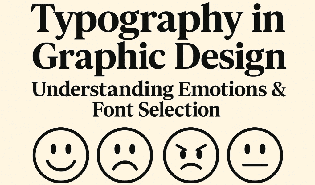
Typography isn’t just about aesthetics—it’s a powerful psychological tool that shapes how people perceive your brand, read your content, and even make decisions. The right (or wrong) font can:
✔ Boost trust or trigger skepticism
✔ Enhance readability or cause fatigue
✔ Evoke luxury or feel cheap
In this deep dive, we’ll explore:
- How fonts manipulate emotions
- The hidden meanings behind typefaces
- Font pairing strategies for maximum impact
- Real-world examples of typography psychology
1. The Emotional Impact of Font Categories
A. Serif Fonts (E.g., Times New Roman, Georgia)
- Psychology: Tradition, authority, reliability
- Best For: Luxury brands, newspapers, academic papers
- Example: The New York Times uses serifs to convey credibility.
B. Sans-Serif Fonts (E.g., Helvetica, Arial)
- Psychology: Modernity, cleanliness, approachability
- Best For: Tech brands (Apple), minimalistic design
- Example: Google’s switch to Product Sans reflected simplicity.
C. Script Fonts (E.g., Brush Script, Lobster)
- Psychology: Creativity, elegance, femininity
- Best For: Wedding invites, beauty brands, artisanal products
- Warning: Overuse feels cliché (e.g., “Mom’s Diner” signs).
D. Display/Decorative Fonts (E.g., Comic Sans, Bebas Neue)
- Psychology: Playfulness, boldness, nostalgia
- Best For: Children’s brands, gaming, posters
- Biggest Mistake: Using Comic Sans in professional settings.
E. Monospace Fonts (E.g., Courier, Roboto Mono)
- Psychology: Technical, retro, “hacker” vibe
- Best For: Coding websites, retro tech brands
2. How Typography Influences Behavior
A. Trust & Credibility
- Study: Users distrust websites with hard-to-read fonts (University of Michigan).
- Fix: Use clean, medium-weight sans-serifs (e.g., Open Sans) for body text.
B. Perceived Value
- Luxury Brands: Serifs (e.g., Vogue’s Didot) = high-end.
- Budget Brands: Rounded sans-serifs (e.g., Ikea’s Verdana) = affordability.
C. Readability & Comprehension
- Best Practices:
- Line spacing = 1.5x font size
- Font size = 16px minimum for web
- Avoid all caps (feels like shouting)
3. Font Pairing Psychology
Pair fonts like a pro using these contrasting yet harmonious combinations:
| Primary Font | Pair With | Effect |
|---|---|---|
| Bold Sans-Serif (Montserrat) | Serif (Playfair Display) | Modern + Elegant |
| Geometric Sans (Futura) | Handwritten Script | Professional + Creative |
| Slab Serif (Rockwell) | Thin Sans-Serif (Lato Light) | Bold + Balanced |
🔗 Tool: Try FontPair for pre-tested combos.
4. Real-World Examples
A. Coca-Cola’s Script Font
- Why It Works: Feels nostalgic, happy, and timeless.
B. Airbnb’s Custom “Cereal” Font
- Why It Works: Friendly, rounded sans-serif aligns with “belonging.”
C. NASA’s “Worm” Logo (Retro Font)
- Why It Works: Futuristic yet retro—perfect for space exploration.
5. Common Typography Mistakes
❌ Using too many fonts (Stick to 2-3 max).
❌ Ignoring hierarchy (Headings vs. body text).
❌ Poor contrast (Light gray text on white = unreadable).
❌ Trendy fonts that age poorly (e.g., Papyrus, Curlz MT).
FAQs
Q1. What’s the most trustworthy font?
A: Serif fonts (e.g., Georgia) for print, sans-serifs (e.g., Helvetica) for digital.
Q2. Why do luxury brands use thin fonts?
A: Thin strokes = exclusivity (e.g., Chanel’s sleek typography).
Q3. How do fonts affect conversions?
A:
- Sans-serifs = Better for web readability.
- Bold fonts = Higher click-through rates (CTAs).
Key Takeaways
✅ Serif = Trust | Sans-Serif = Modern | Script = Elegance
✅ Pair contrasting fonts (e.g., serif + sans-serif).
✅ Prioritize readability (size, spacing, contrast).
✅ Test fonts with your audience (A/B test headlines).
🔗 Free Font Resources:
Now it’s your turn! What’s your favorite font and why? Comment below!


Tags
Typography, Font Psychology, Graphic Design, Branding, UX Design
Hashtags
#Typography #FontPsychology #DesignTips #BrandIdentity #UXDesign #Typeface


