In the world of design, one principle stands out as a favorite among top brands—simplicity. Whether it’s Apple, Microsoft, Adidas, or any other industry leader, they all rely on simplicity to create visually appealing, timeless, and premium designs.
But why is simplicity such a powerful design principle? Research suggests two key reasons:
- Aesthetic Appeal – The simpler a design, the more premium and luxurious it appears.
- Longevity – Simple designs remain visually pleasing for longer, preventing viewer fatigue.
In this article, we’ll explore how simplicity works in design, why major brands use it, and how you can apply it to your own projects.
Why Simplicity Works: The Psychology Behind It
1. Simplicity Enhances Perception of Luxury
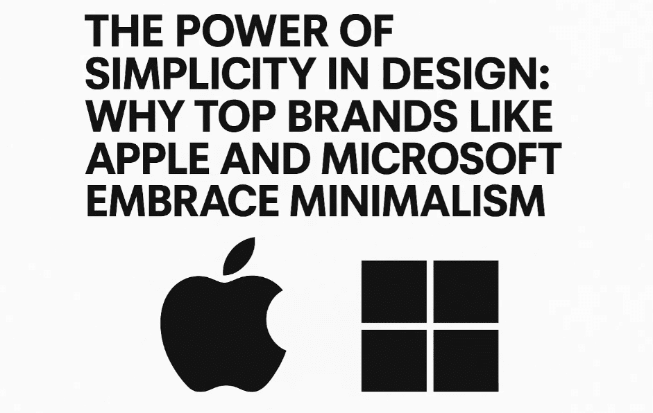
A minimalist design often feels more sophisticated. Think of Apple’s logo evolution—from a detailed illustration to a sleek, monochromatic apple. The simpler version looks more premium.
2. Simplicity Increases Longevity
Complex designs with bold colors and excessive elements can become overwhelming quickly. On the other hand, neutral and simple designs remain visually comfortable over time.
Example: Color Choices in Fashion & Interior Design
- If you wear a bright red coat, people will notice it every time, making it seem like you wear it too often—even if you only wear it twice a month.
- A gray coat, however, can be worn multiple times without drawing excessive attention.
- Similarly, bold-colored rooms (like red or blue) may feel exciting at first but can become tiring, whereas neutral tones (white, gray) remain timeless.
This principle applies to branding, UI/UX, and graphic design.
How Top Brands Use Simplicity in Design
1. Minimalist Logos
- Apple – Shifted from a detailed rainbow apple to a monochrome silhouette.
- Nike – Uses a simple swoosh, instantly recognizable.
- Adidas – Simplified its logo to three clean stripes.
2. Clean UI/UX Design
- Microsoft (Fluent Design) – Uses subtle gradients, ample whitespace, and minimal icons.
- Google (Material Design) – Focuses on flat, simple elements with intuitive interactions.
3. Advertising & Packaging
Luxury brands like Rolex, Chanel, and Tesla use minimal text, high-quality imagery, and neutral backgrounds to convey exclusivity.
How to Apply Simplicity in Your Designs
1. Limit Your Color Palette
Stick to 2-3 primary colors (e.g., black and yellow, white and navy). Avoid excessive gradients or clashing hues.
2. Use Whitespace Effectively
Whitespace (negative space) helps focus attention on key elements. Example: Apple’s product pages.
3. Simplify Typography
- Choose one primary font (e.g., Helvetica, Roboto).
- Use bold and regular weights for hierarchy.
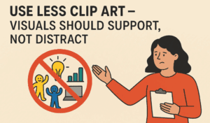
4. Reduce Clutter in Layouts
- Remove unnecessary icons, shapes, or decorative elements.
- Focus on one key message per design.
Examples of Simple Yet Effective Designs
Example 1: Minimalist Poster
- Colors: Black & Yellow
- Elements: Clean typography, no extra shapes.
- Result: Professional, easy to read, and visually appealing.
Example 2: E-commerce Ad
- Focus: Highlighting a 50% sale.
- Design: Neutral background, small product image, bold discount text.
- Result: Looks premium, not overwhelming.
Example 3: Banking Ad
- Concept: “Comfortable Banking – Do it from your seat.”
- Execution: A sofa with a banking app UI instead of a person.
- Result: Creative yet simple, conveying the message without clutter.
FAQs on Simplicity in Design
Q: Does simplicity mean boring design?
A: No! Simplicity removes distractions, making the core message stronger. Think of Tesla’s website—minimal but powerful.
Q: How do I balance simplicity and creativity?
A: Use one standout creative element (e.g., a unique image or typography) while keeping the rest clean.


Q: Which tools help create minimalist designs?
A:
- Adobe Illustrator (Official Site) – For vector-based designs.
- Figma (Official Site) – For UI/UX and collaborative design.
- Canva (Official Site) – For quick social media graphics.
Conclusion
Simplicity isn’t about removing creativity—it’s about enhancing clarity and impact. By adopting minimalist principles, your designs will look more professional, timeless, and engaging.
Want to learn more about design principles? Explore our other articles on [balance](), [contrast](), and [typography]().
Tags:
Design Principles, Minimalism, Graphic Design, Branding, UI/UX, Adobe Illustrator, Figma, Canva
Hashtags:
#DesignTips #MinimalistDesign #GraphicDesign #BrandIdentity #UXDesign #SimplicityInDesign
Disclaimer: Some links may be affiliate-based, supporting our content at no extra cost to you. We only recommend tools we trust.


