Google is once again redefining the way its products look and feel with the debut of Material 3 Expressive, the latest evolution in its design language. With bold typography, vibrant colors, and dynamic animations, this new visual style is already being dubbed “full Gen Z.” But how did we get here?
To fully understand what Material 3 Expressive means for Android, Chrome, Gmail, and the wider Google ecosystem, let’s take a nostalgic yet insightful journey through over a decade of Material Design—from the early days of Holo, to the ambitious beginnings of Material 1.0, the personalization of Material You, and now the bouncy, expressive look of 2025 and beyond.
📜 Step 1: The Pre-Material Days — Enter Holo (2011–2013)
Before Material Design was even a thing, Google’s apps lacked a unified look. Gmail on desktop, Chrome on Windows, and Android all felt completely different.
But Android had its own visual language—Holo, a futuristic UI spearheaded by Matias Duarte (formerly of Palm). While its sharp neon-blue lines and digital aesthetic might feel dated now, Holo set the stage for what was to come by:
- Breaking away from skeuomorphism (design mimicking real-world objects).
- Introducing more minimal and flat design principles.
- Creating the first seeds of visual consistency in Android.
Still, it was only a mobile thing. Google’s broader product ecosystem remained visually fragmented.
🧱 Step 2: Material Design 1.0 — The Digital Paper Revolution (2014–2018)
At Google I/O 2014, Matias Duarte unveiled a new vision: Material Design, based on the idea of “intelligent material” — a digital surface that behaves like paper but reacts to touch, movement, and light.
Let’s pause and appreciate the core ideas behind Material 1.0:
🌟 Key Features of Material 1.0:
- Geometric layers with bold shadows to create depth.
- Slick linking animations that made transitions feel tangible.
- Floating Action Buttons (FABs) and Hamburger Menus became UI staples.
- Colorful palettes and clear typographic hierarchy.
Google wanted Material to work across all form factors—Android, Chromebooks, wearables, and the web. But reality hit hard.
😬 Real-World Challenges:
- Each Google app team interpreted Material differently.
- Developers rushed to meet Android 5 (Lollipop) deadlines.
- Many apps looked like “paper skins” slapped onto Android 4 foundations.
Despite setbacks, Google committed to Material, updating its logo in 2015 and slowly bringing Material-themed interfaces to web apps like Gmail and Calendar (though many weren’t complete until 2017–2018).
🎨 Step 3: Material You (Material U) — Personalization Takes Center Stage (2021–2023)
By 2020, Material Design had started to feel… stale. Android apps looked the same, and the vibrant spirit of the original concept was gone. Then came Material You, launched alongside Android 12 and the Pixel 6.
This version was all about you — the user. Let’s dive into what changed.

🎯 What Made Material You Different:
- Personalized color palettes generated from your wallpaper.
- Muted backgrounds and punchy accents for contrast.
- Softer corners, rounded shapes, and fewer harsh angles.
- More expressive widgets with whimsical designs.
- New font: Google Sans, replacing Roboto on Pixel devices.
📱 A Pixel-First Experience:
Pixel devices became the poster child of Material You. But other OEMs (like Samsung) were slow to adopt, and often implemented watered-down versions of the UI.
That said, animations became smoother and more dynamic—especially in lock screen transitions, fingerprint effects, and app launches.
💥 Step 4: Material 3 Expressive — Gen Z’s UI Era Begins (2025 Onward)
Now let’s move to the exciting part — the latest evolution: Material 3 Expressive, launching with Android 16 and likely debuting on the Pixel 10.
So far, we’ve covered Google’s journey from sterile UI uniformity to personalized flair. Now, it’s time to make things fun, bold, and vibrant again.
🎯 What’s New in Material 3 Expressive:
- Bolder colors with more contrast (not just muted wallpaper tones).
- Semantic colors that don’t change based on themes.
- New geometric shapes: pixelated cutouts, spiky frames, blob-like containers.
- Physics-based animations: toggles bounce, lists spring into place.
- Blurred backgrounds in the notification shade and task switcher.
- Multiple fonts used across apps for stronger visual hierarchy.
This shift is aimed squarely at younger users — specifically Gen Z — who have grown tired of the overly minimal, flat designs of the 2010s.
🧩 Android vs Web — Will Material 3 Expressive Go Everywhere?
Right now, the loudest changes are coming to Android, but what about the web?
Apps like Gmail, Google Drive, and Calendar prioritize information density, which might conflict with Expressive’s more playful, open layouts.
We expect:
- Mobile apps (especially Pixel) will lead the adoption.
- Web and productivity tools will take a subtler approach—preserving function over flash.
⚖️ Pros & Concerns of Material 3 Expressive
✅ What Works:
- More visual personality across apps.
- Enhanced motion and animation for a smoother UX.
- Greater font and shape diversity adds visual depth.
❌ Potential Downsides:
- Reduced information density in productivity apps.
- Developers may be slow to adopt, just like with Material You.
- Fragmentation across OEMs may return.
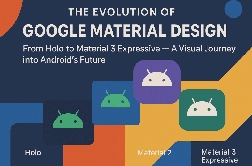
🔄 Recap of the Material Evolution
| Version | Year | Core Focus | Notable Features |
|---|---|---|---|
| Holo | 2011–2013 | Futuristic UI for Android only | Neon blue, dark UI, minimal skeuomorphism |
| Material 1.0 | 2014–2018 | Depth, layers, motion | Shadows, FABs, animations, paper metaphor |
| Material You | 2021–2023 | Personalization & softness | Dynamic theming, rounded widgets, Google Sans |
| Material 3 Expressive | 2025– | Bold, Gen Z-inspired visuals | Bright colors, diverse shapes, springy animations |
🧠 Frequently Asked Questions (FAQs)
❓ Is Material 3 Expressive only for Pixel phones?
Not exactly. It launches first on Pixel (like previous versions), but other OEMs can implement it with Android 16. Whether they fully adopt it remains to be seen.
❓ Will my Gmail and Calendar apps change drastically?
Unlikely. Google may apply subtle changes to keep productivity tools practical and familiar.
❓ Can I turn off the personalization features?
Material 3 still supports dynamic theming, but many of the new expressive elements are part of the core design.
📢 Final Thoughts: Google’s Most Bold Visual Leap Since Material 1.0
Material 3 Expressive isn’t just a design tweak — it’s a statement. After years of sterile minimalism, Google is embracing fun, character, and creativity again.
While it may not be as radical as Material 1.0 or as customizable as Material You, it’s setting a new direction — one that reflects the tastes of a new generation and signals where design might head in the 2030s.
Whether you love it or not, there’s no denying one thing: Google wants its products to feel alive again.
🏷️ Tags:
material design 3, material you, android 16 design, google pixel 10 ui, expressive design system, material 3 vs material you, android design history, material ui evolution, gen z ui trends, google material expressive
🔖 Hashtags:
#MaterialDesign #MaterialYou #Android16 #Material3Expressive #UIDesign #Pixel10 #AndroidDesign #GoogleUX #GenZDesign #GoogleMaterialEvolution
Disclaimer: This article reflects features and design directions shown in Android 16 beta and Google’s official documentation as of mid-2025. Final implementation may vary across devices and platforms. Always refer to Google’s Material Design site for up-to-date information.