Whether you’re creating a flyer, designing a brochure, or working on a multi-page newsletter, good design principles can make or break your project. Desktop publishing isn’t just about making things look pretty — it’s about clear, effective communication. These 12 time-tested rules will guide you toward creating designs that are not only beautiful but also functional and professional.
1. Use Only One Space After Punctuation
Forget the double space after periods — that’s a habit from the typewriter era. Today, with proportionally spaced fonts, one space is all you need for clean, professional typography.
🔗 Read More
2. Don’t Use Double-Hard Returns After Paragraphs
Using two hard returns to space paragraphs is outdated. Modern publishing software allows you to set precise spacing through paragraph formatting, which gives better control and appearance.
🔗 Read More
3. Use Fewer Fonts
Font overload is real. Stick to two or three typefaces per project to maintain visual harmony and ensure readability. Save the wild font play for experimental art.
🔗 Read More
4. Use Ragged-Right or Fully Justified Text Appropriately
Both left-aligned (ragged-right) and fully justified text have their place. The best choice depends on your audience, layout, and purpose. Don’t blindly follow trends — design with intention.
🔗 Read More
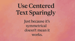
5. Use Centered Text Sparingly
Centered text works great for invitations or formal headings — not so much for body text. It’s harder to read and can disrupt visual flow when overused.
🔗 Read More
6. Balance Line Length with Type Size
Too long or too short lines make text hard to read. Match your font size with appropriate line length using simple formulas to ensure smooth readability.
🔗 Read More
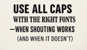
7. Use All Caps with the Right Fonts
All caps can scream for attention — sometimes literally. When used right (and sparingly), all caps can emphasize key text. But pick your fonts carefully and avoid decorative overload.
🔗 Read More
8. Use Proper Typographical Punctuation
Typography is more than just words. Curly quotes, proper dashes, and ellipses show attention to detail. These subtleties make your design feel polished and professional.
🔗 Read More
9. Use Frames, Boxes, and Borders with a Purpose
Borders and frames can add clarity or chaos. Use them intentionally to group, highlight, or separate — not just because they’re easy to add.
🔗 Read More
10. Use Less Clip Art
Clip art should support your message, not clutter your layout. One strong image speaks louder than ten scattered ones. Be minimal and be meaningful.
🔗 Read More


11. Use More White Space
White space isn’t wasted space — it’s breathing room for your content. It makes your layout elegant, readable, and less chaotic. Learn to embrace the space.
🔗 Read More
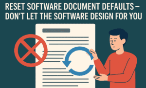
12. Reset Software Document Defaults
Don’t let software defaults dictate your design. Customize settings like margins, spacing, and fonts to suit your layout — not the other way around.
🔗 Read More
Final Thoughts
These rules aren’t about following strict dos and don’ts — they’re about creating communication that connects. As you move through each rule in detail (which you can access via the “Read More” links), remember that great design balances creativity with clarity. If you’re serious about desktop publishing, internalizing these principles will elevate your work beyond the amateur level.
🏷️ Tags:
desktop publishing, design principles, typography, layout design, white space, graphic design, publishing tips
#Hashtags:
#DesktopPublishing #DesignRules #TypographyTips #GraphicDesign #PageLayout #DesignForPrint


