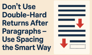
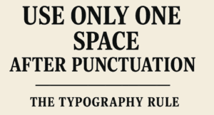
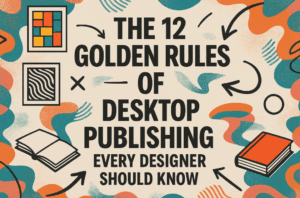
This article is a part of “The 12 Golden Rules of Desktop Publishing Every Designer Should Know“ You’ve chosen your fonts carefully, balanced your line lengths, added the right spacing, and picked a color...
Read More
Use More White Space – Give Your Design Room to Breathe
This article is a part of “The 12 Golden Rules of Desktop Publishing Every Designer Should Know“ In design, white space isn’t wasted space — it’s breathing space. It’s what gives your content clarity,...
Read More
Use Less Clip Art – Visuals Should Support, Not Distract
This article is a part of “The 12 Golden Rules of Desktop Publishing Every Designer Should Know“ Clip art can be charming, quirky, and even nostalgic — but when overused or misused, it can...
Read More
Use Frames, Boxes, and Borders with a Purpose – Don’t Box In Your Design
This article is a part of “The 12 Golden Rules of Desktop Publishing Every Designer Should Know“ Ever seen a flyer where everything is in a box? Maybe even boxes within boxes? It might...
Read More
Use Proper Typographical Punctuation – Little Marks, Big Impact
This article is a part of “The 12 Golden Rules of Desktop Publishing Every Designer Should Know“ Imagine designing a beautifully laid-out magazine or brochure — only to fill it with straight quotes, hyphen...
Read More
Use All Caps with the Right Fonts – When Shouting Works (and When It Doesn’t)
This article is a part of “The 12 Golden Rules of Desktop Publishing Every Designer Should Know“ YOU’VE SEEN TEXT LIKE THIS, RIGHT?IT FEELS LIKE SOMEONE’S YELLING AT YOU. That’s the power — and...
Read More
Balance Line Length with Type Size – The Secret to Effortless Reading Flow
This article is a part of “The 12 Golden Rules of Desktop Publishing Every Designer Should Know“ Ever found yourself rereading a sentence multiple times, even though the words were simple? It might not...
Read More
Use Centered Text Sparingly – Just Because It’s Symmetrical Doesn’t Mean It Works
This article is a part of “The 12 Golden Rules of Desktop Publishing Every Designer Should Know“ Let’s be honest — centered text looks elegant at first glance. It’s symmetrical, formal, and feels… balanced....
Read More
Use Ragged-Right or Fully Justified Text Appropriately – It’s Not a Battle, It’s About Balance
This article is a part of “The 12 Golden Rules of Desktop Publishing Every Designer Should Know“ If you’ve ever had a debate about text alignment, you’re not alone. Some designers swear by justified...
Read More
Use Fewer Fonts – Mastering Typography with Simplicity
This article is a part of “The 12 Golden Rules of Desktop Publishing Every Designer Should Know“ If your design looks chaotic and cluttered, there’s a good chance it’s suffering from font overload. In...
Read More
Don’t Use Double-Hard Returns After Paragraphs – Use Spacing the Smart Way
This article is a part of “The 12 Golden Rules of Desktop Publishing Every Designer Should Know“ If you’ve ever tapped the Enter key twice to create a gap between two paragraphs — you’re...
Read More
Use Only One Space After Punctuation – The Typography Rule You Didn’t Know You Were Breaking
This article is a part of “The 12 Golden Rules of Desktop Publishing Every Designer Should Know“ Have you ever hit the spacebar twice after typing a period? You’re not alone — and you’re...
Read More
The 12 Golden Rules of Desktop Publishing Every Designer Should Know
Whether you’re creating a flyer, designing a brochure, or working on a multi-page newsletter, good design principles can make or break your project. Desktop publishing isn’t just about making things look pretty — it’s...
Read More
A to Z of Adobe InDesign: 26 Expert Tips and Tricks to Boost Your Workflow
Adobe InDesign is a powerhouse when it comes to desktop publishing, layout design, and creative print projects. Whether you’re a seasoned designer or just getting started, mastering a few insider tips can make your...
Read More
10 Essential Tips to Master Adobe InDesign for Better Workflow
Adobe InDesign is a powerful desktop publishing tool, and mastering it can significantly improve your design speed, workflow efficiency, and expertise. In this article, we’ll explore 10 practical tips to help you enhance your...
Read More
Regular Dotted Letter English Alpahbet Font – Best for Tracing Letter Book for Kids
Hello friends! Welcome to Desktop Publishing Tips. If you are a regular visitor to my channel, you already know that I provide valuable information related to desktop publishing, book layout design, and graphic design....
Read More
Controlling Widow and Orphan Words Using GREP in Adobe InDesign
Hello friends, welcome to Desktop Publishing Tips! Once again, I welcome you all to my channel. Today, we are continuing our discussion on Adobe InDesign, specifically focusing on GREP. So far, we’ve introduced GREP...
Read More
Easy Fix CorelDRAW Has Stopped Working – 100% working solution
Hello friends, Welcome to Desktop Publishing Tips! Today, in this blog post, we will explain a very common problem faced by CorelDRAW users and provide a simple solution to fix it. 1. Introduction CorelDRAW...
Read More
How to Create an MCQ Question Paper Using InDesign: A Detailed Guide with proper styling
Hello friends, welcome to Desktop Publishing Tips. Today, I am excited to share a fantastic topic with you: how to layout MCQ questions in InDesign and how to add characters for OMR sheets. I’ll...
Read More
How to retrieve font name from a JPG image? Simplest method :)
If you design a lot of covers then applying the best font is toughest part. Sometimes we have the reference images with good fonts but being an image file, catching the font name is...
Read More


