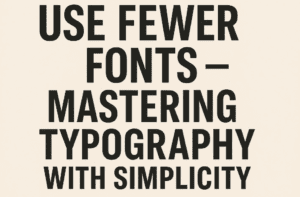
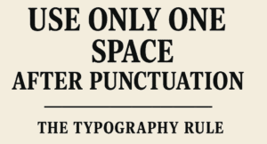
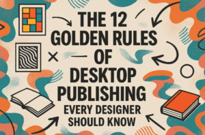
This article is a part of “The 12 Golden Rules of Desktop Publishing Every Designer Should Know“ Ever found yourself rereading a sentence multiple times, even though the words were simple? It might not...
Read More
Use Ragged-Right or Fully Justified Text Appropriately – It’s Not a Battle, It’s About Balance
This article is a part of “The 12 Golden Rules of Desktop Publishing Every Designer Should Know“ If you’ve ever had a debate about text alignment, you’re not alone. Some designers swear by justified...
Read More
Use Fewer Fonts – Mastering Typography with Simplicity
This article is a part of “The 12 Golden Rules of Desktop Publishing Every Designer Should Know“ If your design looks chaotic and cluttered, there’s a good chance it’s suffering from font overload. In...
Read More
Use Only One Space After Punctuation – The Typography Rule You Didn’t Know You Were Breaking
This article is a part of “The 12 Golden Rules of Desktop Publishing Every Designer Should Know“ Have you ever hit the spacebar twice after typing a period? You’re not alone — and you’re...
Read More
The 12 Golden Rules of Desktop Publishing Every Designer Should Know
Whether you’re creating a flyer, designing a brochure, or working on a multi-page newsletter, good design principles can make or break your project. Desktop publishing isn’t just about making things look pretty — it’s...
Read More


