Good typography is like good design—it’s often invisible. It seamlessly integrates into the reading experience, allowing the message to be consumed effortlessly. When typography goes wrong, it can result in amateur layouts and uncomfortable reading experiences. In this article, we’ll explore seven practical techniques in Adobe InDesign that will elevate your typesetting skills to a professional level.
1. Entry Points for Engagement
To draw readers into your content, you need strong entry points. These can take various forms:
- Drop caps: Oversized initial letters at the start of a paragraph.
- Headings and titles: Create structure and focus.
- Pull quotes: Highlight key excerpts to capture attention.
- Graphical elements: Arrows or icons that direct the reader’s eye.
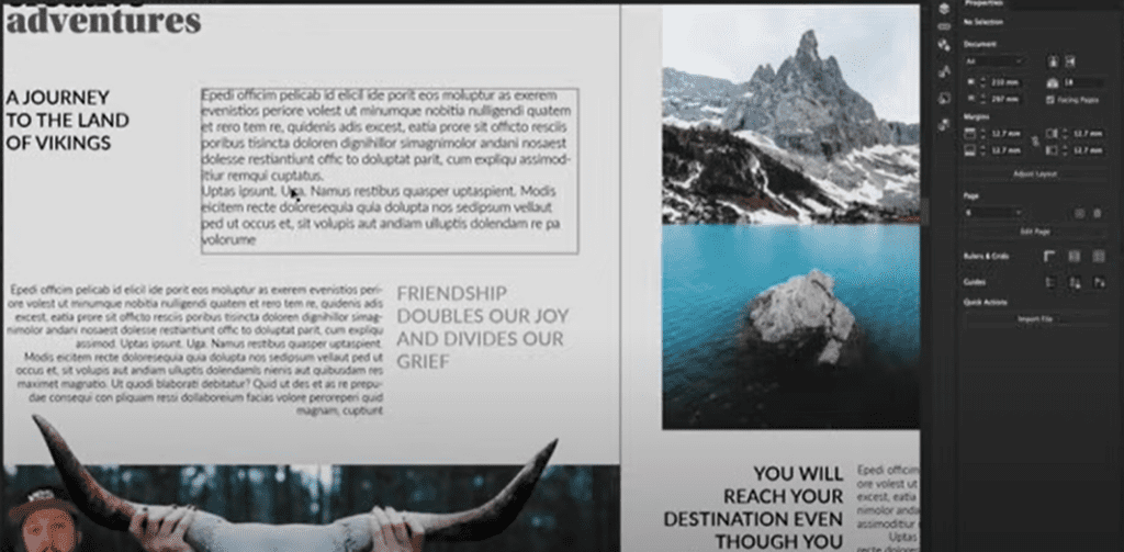
For example, a layout with a bold title, subheadings, and a pull quote becomes much more engaging than a plain block of text. Without these elements, even a well-aligned spread may lack that visual pull.
2. Indentation Rules for Body Copy
Indentation is a classic way to visually separate paragraphs, but it must be used thoughtfully:
- Avoid indenting the first paragraph of a block of text, as the surrounding space already provides separation.
- Use consistent indent size for subsequent paragraphs, typically set through the “First Line Indent” option in the Paragraph panel.
- Drop caps can also be a great alternative to indentation for the first paragraph, adding a stylish entry point while maintaining readability.
3. Optimal Line Length for Readability
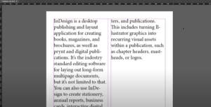
Line length, or “measure,” is critical for a comfortable reading experience. Aim for 45 to 90 characters per line, including spaces.
- Check the character count by selecting a line and viewing the Info panel in InDesign.
- Adjust column width to fit within this range. Narrow columns cause excessive eye movement, while overly wide columns make it difficult for the reader to track lines.
4. Alignment: Finding the Right Fit
Alignment plays a significant role in typography design:
- Left-aligned (flush left) is the most common and reader-friendly alignment.
- Justified text provides clean edges on both sides but can create “rivers” (large gaps between words) if not managed carefully. To minimize this:
- Use justified alignment only for lines longer than 60 characters.
- Enable hyphenation to balance spacing.
- Avoid justification on narrow columns.
For specialized alignments like flush right, use them sparingly to create intentional visual effects, such as aligning pull quotes or captions.
5. Spacing Between Paragraphs
Breaking up blocks of text makes reading more comfortable:
- Use either spacing between paragraphs or indents—but not both, as this creates redundancy.
- Adjust the “Space Before” or “Space After” settings in the Paragraph panel to add visual separation without clutter.
6. Pairing Fonts with Balanced x-Heights
When combining fonts within a layout, ensure they harmonize visually:
- Use contrasting styles, such as a serif for headings and a sans-serif for body text, to create hierarchy.
- Match the x-heights (the height of lowercase letters) for consistency. Use typefaces with similar proportions to maintain a cohesive look.
7. Special Typography Features
Maximize InDesign’s advanced features to enhance your layout:
- Optical Margin Alignment: Aligns punctuation like hyphens and quotation marks outside the text frame, creating a polished look.
- Balanced Ragged Lines: For left-aligned text, this feature creates smoother, visually appealing edges.
- Caps Usage: Reserve all caps for headings or short emphasis text. Avoid using it for long passages, as it can feel overwhelming and reduce readability.
Conclusion
By following these practical techniques, you can significantly enhance your InDesign layouts and typography skills. Remember, good typography isn’t just about aesthetics; it’s about creating an enjoyable and efficient reading experience.
#Typography #InDesignTips #GraphicDesign #AdobeInDesign #DesignTechniques #TypesettingTips #TypographyLovers #CreativeDesign


