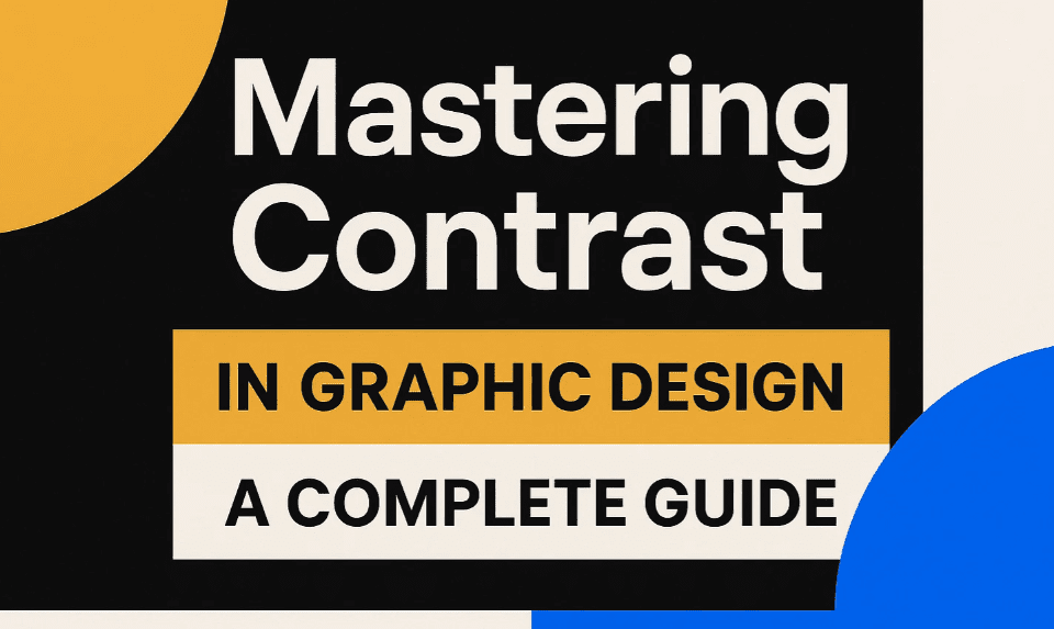
Contrast is one of the most powerful principles in graphic design. It helps grab the viewer’s attention and makes your designs visually striking. Many designers mistakenly believe that contrast is only about colors, but in reality, it can be achieved in multiple ways.
In this article, we’ll explore five key methods to create contrast in your designs, along with real-world examples and practical applications.
What is Contrast in Graphic Design?
Contrast refers to the difference between elements in a design that makes them stand out. It helps guide the viewer’s eye to the most important parts of your composition.
Why is Contrast Important?
- Grabs Attention: Highlights key elements.
- Improves Readability: Makes text and visuals clearer.
- Creates Visual Interest: Adds depth and dynamism.
5 Ways to Create Contrast in Design
1. Contrast Through Shapes
Using different shapes in a design can instantly create visual interest.
How to Use It:
- Mix geometric and organic shapes.
- Break repetition with an unexpected shape.
Examples:
- A shoe advertisement using abstract shapes to highlight the product.
- Packaging design where an unusual shape draws attention to a discount.
Pro Tip:
If most elements are angular, introduce a circular or fluid shape to create contrast.
2. Contrast Through Colors
While color contrast is well-known, it’s not just about black and white.
How to Use It:
- Use complementary colors (e.g., blue & orange).
- Contrast bright vs. muted tones.
Examples:
- A bank logo in red against a blue background to stand out.
- A poster where a single bright element pops against a neutral palette.
Pro Tip:
Tools like Adobe Color help find perfect contrasting color schemes.
3. Contrast Through Size
Varying sizes of elements can emphasize hierarchy.
How to Use It:
- Make key elements larger than others.
- Use small elements to balance big ones.
Examples:
- A travel ad where a mountain is enlarged to dominate the scene.
- A sunscreen ad where the product is oversized compared to people.
Pro Tip:
Avoid making everything the same size—scale creates focus.
4. Contrast Through Layout
Breaking a layout pattern forces the viewer’s eye to stop and notice.
How to Use It:
- Disrupt a grid with an off-center element.
- Rotate an object to stand out.
Examples:
- A concert poster where the “Book Now” button breaks alignment.
- A magazine spread where text suddenly changes direction.
Pro Tip:
Use tools like Figma to experiment with asymmetrical layouts.
5. Contrast Through Typography
Different fonts and styles make text more engaging.
How to Use It:
- Pair bold headlines with light body text.
- Use italics or all-caps for emphasis.
Examples:
- A magazine article where key quotes are in bold.
- A website banner where a call-to-action stands out in a different font.
Pro Tip:
Limit fonts to 2-3 per design to avoid clutter.
FAQs on Contrast in Design
Q: Can I use multiple contrast techniques in one design?
A: Yes! Combining color + size + typography contrast can make designs even stronger.
Q: Does contrast only work in digital designs?
A: No—contrast is essential in print, web, and even packaging design.
Q: What’s the biggest mistake beginners make with contrast?
A: Overusing it—too much contrast can look chaotic. Balance is key.
Conclusion
Contrast isn’t just about colors—it’s about shapes, sizes, layouts, and typography. Mastering these techniques will make your designs more engaging and professional.
Want to improve further? Check out design inspiration on Behance or Dribbble.
Tags:
graphic design, contrast in design, design principles, typography, layout design, color theory
Hashtags:
#GraphicDesign #ContrastInDesign #DesignTips #Typography #ColorTheory #LayoutDesign
Disclaimer: The examples provided are for educational purposes. Always align contrast techniques with your brand’s style guide.
Got questions? Drop them in the comments below! 🚀
