In the world of graphic design, one of the most common challenges is selecting the right color palette. Whether you are a beginner or an experienced designer, choosing colors that resonate with a brand’s identity and message is crucial.
This blog post will guide you step-by-step on how to easily pick colors directly from logos and product images, making your designs look professional and brand-aligned. This method saves time and ensures that your final artwork reflects the identity of the company or product you’re designing for.
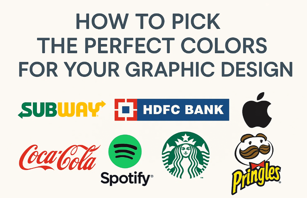
🖌 Why Choose Colors from Logos or Products?
Designing based on an existing logo or product image gives you two major benefits:
- Brand Consistency – It ensures the design reflects the exact color identity of the brand.
- Time-Saving – Instead of experimenting with multiple color palettes, you can directly extract colors from the logo or product.
🎨 Step-by-Step Guide to Pick Colors from Logos
Step 1: Search and Download a Logo
- Open your browser and search for the logo you want in PNG format (transparent background preferred).
Example: Search “Subway PNG logo” or “ICICI Bank PNG logo”. - Download the logo and insert it into your design file in software like Adobe Illustrator, CorelDRAW, or Photoshop.
Step 2: Pick Primary Colors from the Logo
- Analyze the logo to identify its primary colors. For example:
- Subway: Green, Yellow, and White.
- HDFC Bank: Blue, Red, and White.
- Use the Eyedropper Tool to pick colors directly from the logo and apply them to your design elements like shapes, icons, and text.
✅ Tip: Use the colors exactly or make slight brightness/saturation adjustments to suit your background.
🧪 Examples of Applying Logo Colors in Designs
Example 1: Subway Logo Colors
- Base Color: Green
- Text Highlight: Yellow
- Supporting Elements: White or light gray
By using Subway’s signature colors, your design will instantly relate to the brand and feel cohesive.
Example 2: HDFC Bank Logo Colors
- Text: Deep Blue (from logo)
- Button Color: Bright Red (from logo)
- Backgrounds: Light Blue or neutral tones to match the corporate feel
Using a banking brand’s logo colors makes your design appear as if it’s been custom-made for that brand.
Example 3: ICICI Bank Logo Colors
- Pick the blue tone from the logo and apply it to headlines or buttons.
- Use complementary colors (like white or orange) for contrast.
This approach works great when working with financial institutions where consistency and trust are key.
🛍 Using Product Colors in Design
Not just logos — product images can also serve as a great source for color inspiration.
How to Do It:
- Take a product photo (e.g., a black shampoo bottle with golden text).
- Use the Eyedropper Tool to extract the exact black and gold shades.
- Apply those colors to the background, shapes, or call-to-action buttons in your design.
🟠 Pro Tip: Matching your background or text to the product’s color makes the design feel tailor-made and unified.
🙋♂️ Frequently Asked Questions
Q1. Why not use online color palette generators instead?
A: While online tools are helpful, they often don’t align with brand-specific tones. Picking from the brand’s own logo/product guarantees exact identity and trust-building consistency.
Q2. What if the logo has gradient or complex shades?
A: Choose the most dominant flat colors. For gradients, try selecting the lightest and darkest points to build your palette.


Q3. Can I adjust the picked color slightly?
A: Yes, but only if it helps with readability or harmony. Don’t stray too far from the brand’s identity.
🔚 Conclusion
Picking colors from logos or product packaging is a simple but powerful technique every graphic designer should know. It brings authenticity, brand alignment, and professionalism into your design without requiring complex color theory knowledge.
Instead of wasting time browsing color palettes, just:
- Pick a logo or product image,
- Use the eyedropper tool,
- And apply those colors consistently across your layout.
This method is particularly useful when you’re creating:
- Corporate designs
- Social media banners
- Flyers or posters for brands
- Product packaging mockups
🧷 Tags:
graphic design, logo color picking, branding, adobe illustrator, product color palette, color matching, design tutorial, brand design, design inspiration
🏷 Hashtags:
#GraphicDesign #LogoColors #ColorTheory #BrandDesign #DesignTips #ProductBranding #DesignInspiration #AdobeIllustrator
🔗 Useful Links:
⚠️ Disclaimer:
This article is meant for educational and training purposes only. All brand logos and product images are used here as examples and remain the property of their respective trademark owners. Make sure to obtain proper permission or use royalty-free resources when using logos in commercial projects.
Let us know in the comments if you’ve tried this technique in your own design work!


