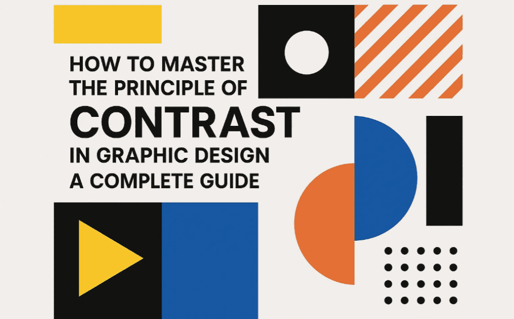
In the world of graphic design, if there’s one principle that truly helps grab a viewer’s attention, it’s Contrast. While many people mistakenly believe that contrast is only about colors, the reality is far broader. Effective use of contrast can drastically improve the visibility and impact of your design elements—whether it’s through shapes, sizes, layout, or typography.
This blog post will guide you through five different types of contrast techniques you can use to make your graphic designs more effective and visually striking.
What is Contrast in Graphic Design?
Contrast is the practice of placing opposing elements together to highlight their differences and grab attention. In graphic design, contrast helps in directing the viewer’s focus to the most important part of the design, whether it’s a message, call-to-action, product image, or logo.
Contrary to popular belief, contrast is not just about using different colors—you can create contrast using shapes, sizes, layouts, and even text formatting.
1. Contrast Using Shapes
One of the simplest yet powerful ways to create contrast is by using unusual or standout shapes in a design filled with uniform elements.
How to Use:
- Insert a unique shape amidst standard design patterns.
- Use abstract or geometric shapes to attract attention to a specific point.
Real-world Example:
In a packaging design with a basic background, a designer added an irregular orange splash shape behind the product text, instantly drawing attention.
Tip: You can also combine shape contrast with color contrast for even stronger emphasis.
2. Contrast Using Colors
Color is the most commonly used method for creating contrast. But to use it effectively, you need to think beyond just choosing bright vs. dull shades.
How to Use:
- Use complementary or opposing colors (e.g., red against blue).
- Apply color contrast to buttons, CTAs, or headers to separate them from the background.
Real-world Example:
In a design where everything is in blue, using a red logo in the center pulls the viewer’s attention instantly. This technique is often used in branding to highlight logos or important offers.
3. Contrast Using Size
Changing the size of design elements can direct viewers’ eyes exactly where you want them to look.
How to Use:
- Use a significantly larger or smaller size for an element you want to highlight.
- Use size contrast between headings and subheadings to establish hierarchy.
Real-world Example:
In an ad showing mountains and people, the product (like a sunscreen bottle) was shown as significantly larger than its surroundings to highlight it. This artificial scaling is used intentionally to create visual importance.


4. Contrast Using Layout
Breaking the layout pattern can create a focal point and direct attention to a specific area.
How to Use:
- Disrupt a repeated layout with a rotated element or an unexpected object.
- Introduce a standout element in an otherwise symmetrical grid.
Real-world Example:
In a poster with a structured layout of event details (date, venue, time), the “Book Now” CTA was placed diagonally with a bold shape to break the layout flow and catch the eye.
5. Contrast Using Text Formatting
Typography can also be used to create contrast. By changing the font, weight, size, or style, you can highlight key messages.
How to Use:
- Use bold headings and italic subheadings for emphasis.
- Change text color slightly to add contrast without disrupting the design harmony.
Real-world Example:
In a magazine article layout, even if readers ignore most of the content, they still end up reading the bolded or italicized text sections that were designed to stand out.
Summary: Different Ways to Create Contrast in Design
| Method | Description |
|---|---|
| Shape | Use irregular or different shapes to grab attention. |
| Color | Apply color contrasts to differentiate elements. |
| Size | Use bigger or smaller sizes to highlight important components. |
| Layout | Break layout patterns to emphasize certain areas. |
| Text Formatting | Use bold, italic, or colored fonts for typographic contrast. |
Frequently Asked Questions (FAQs)
Q1. Is color contrast enough to make a design effective?
A: Not always. While color is powerful, combining multiple contrast methods—like size and layout—will give your design a greater impact.
Q2. Can shape contrast be used in minimalist design?
A: Absolutely. Even a single distinct shape in a minimal layout can effectively draw focus.
Q3. How can I learn to balance contrast without making the design too loud?
A: Practice using contrast with restraint. Keep your goal in mind—what do you want the viewer to notice first? Use contrast just enough to guide them there.
Final Thoughts
The principle of contrast is essential in graphic design because it helps communicate messages clearly and draws attention where it matters most. It’s not limited to color alone—shapes, layout, size, and typography can all be leveraged to create compelling visual contrast.
By applying these techniques properly, you can dramatically improve the effectiveness of your graphic designs and increase viewer engagement.
Tags:
graphic design principles, contrast in design, design contrast tips, visual hierarchy, how to use contrast, design with shapes, color contrast, layout design contrast, size contrast, text contrast
Hashtags:
#GraphicDesign #DesignPrinciples #ContrastDesign #VisualHierarchy #TypographyTips #ColorTheory #DesignTips #CreativeDesign #LayoutDesign #DesignContrast
Disclaimer:
All examples and insights shared in this article are intended for educational purposes. Graphic assets mentioned are for illustration only and are the intellectual property of their respective owners. Always follow fair use and licensing practices in your designs.
If you’re interested in learning more design principles like alignment, balance, proximity, or repetition—stay tuned for more detailed guides right here.