Kerning is the process of adjusting the space between specific pairs of characters to improve the overall appearance and readability of text. Adobe InDesign provides easy-to-use tools to adjust kerning precisely. This article walks you through the process.
Step 1: Open Your Adobe InDesign Document
- Launch Adobe InDesign and open a document with the text you wish to edit.
- If you don’t have Adobe InDesign installed, you can download it from Adobe’s official website.
Step 2: Select the Type Tool
- Locate the Type Tool in the toolbar on the left side of the screen, or press T on your keyboard to activate it.
- Click on the text frame to access the text you want to adjust.
Step 3: Highlight the Desired Text
- Place your cursor between the two characters you wish to adjust.
- For instance, if you want to modify the spacing between “K” and “E,” place the cursor precisely between them.
Step 4: Adjust the Kerning
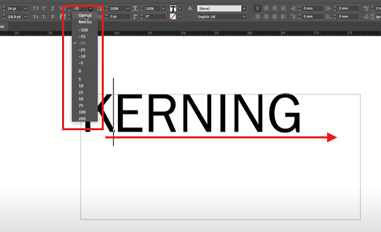
- With the cursor placed, look at the Control Panel at the top of your screen.
- Find the kerning option, often denoted by a “V/A” symbol.
- Use the following methods to adjust kerning:
- Manual Adjustment: Click the up or down arrows next to the kerning value to increase or decrease the space.
- Enter a Custom Value: Type a specific value into the kerning field for precise spacing adjustments.
Step 5: Use Optical or Metric Kerning
- Adobe InDesign offers two predefined kerning options:
- Optical Kerning: Automatically adjusts the spacing based on the shapes of adjacent characters. This is ideal for irregularly spaced fonts or custom typefaces.
- Metric Kerning: Uses the font’s built-in kerning settings, designed by the font creator.
- To apply one of these, click the drop-down menu next to the kerning field and select either Optical or Metric.
Step 6: Review and Refine
- Review your text after adjusting kerning to ensure a balanced and visually appealing layout.
- Make further adjustments if necessary.
Why is Kerning Important?
Proper kerning enhances the legibility and professional appearance of your design. Whether creating posters, brochures, or digital content, thoughtful kerning ensures your text communicates effectively and looks polished.
Tags
Adobe InDesign, text kerning, typography design, kerning tutorial, adjusting text spacing, graphic design tips, kerning in InDesign, design tools, text alignment, Adobe software tips
Hashtags
#AdobeInDesign #TextKerning #Typography #DesignTips #GraphicDesign #AdobeTutorials #TextSpacing #CreativeDesign #InDesignTutorial
