This article is a part of “The 12 Golden Rules of Desktop Publishing Every Designer Should Know“
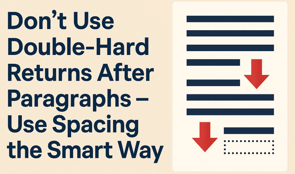
If you’ve ever tapped the Enter key twice to create a gap between two paragraphs — you’re not alone. It’s a habit passed down from the days of typewriters, but in the world of modern desktop publishing, it’s time to let that habit go.
This might seem like a small formatting choice, but trust me — using hard returns the wrong way can break your layout, cause inconsistencies, and make your design harder to manage and update.
Let’s look at why paragraph spacing should be done with intent, not just keystrokes.
⌨️ What Is a Double-Hard Return?
In digital publishing terms, a “hard return” is when you press Enter or Return on your keyboard to start a new line or paragraph. A double-hard return means pressing Enter twice to create blank space between paragraphs.
It’s a trick many learned early on — especially if you came from a typewriting or basic word processing background — but it’s not the right way to space out content anymore.
🛠 Why It Doesn’t Work in Desktop Publishing
Modern publishing tools like Adobe InDesign, Affinity Publisher, Scribus, and even Microsoft Word offer precise paragraph formatting options.
Here’s what goes wrong when you use double-hard returns:
❌ It creates layout inconsistencies
You’ll likely end up with uneven spacing between paragraphs, especially when font sizes or line heights change.
❌ It breaks paragraph styling
If you decide to apply a specific style to all paragraphs — like spacing before/after or alignment — it may not apply properly when hard returns are used inconsistently.
❌ It makes automated formatting harder
Features like reflowable text, automatic tables of contents, and dynamic layout adjustments can behave unpredictably if extra paragraph breaks are sprinkled in manually.


✅ What to Do Instead: Use Paragraph Spacing
The correct way to add space between paragraphs is by adjusting the paragraph style settings.
In Microsoft Word:
- Select your paragraph text.
- Go to Layout → Spacing → After (or “Before”) and set it to 6–12 pt (or whatever looks best).
- Done! You now have consistent spacing between every paragraph — no extra Enter key needed.
In Adobe InDesign:
- Use the Paragraph Panel.
- Set Space Before or Space After values in points.
- Save this as a paragraph style for reuse across your document.
🧠 Pro Tip: Cheat at Copyfitting
Using paragraph spacing lets you fine-tune how much space your text occupies — down to fractions of a line. This makes it easier to fit content neatly without having to remove paragraphs or shrink the font size.
Designers often use smaller-than-normal spacing (like 5pt instead of 12pt) to save space in print layouts — a handy trick for newsletters, flyers, and multi-column layouts.
📌 Example Comparison
| Technique | Result |
|---|---|
| Double-Hard Returns | Uneven spacing, harder to style |
| Paragraph Spacing | Clean, adjustable, consistent |
❓ Frequently Asked Questions
🔹 Can I use both — a hard return and paragraph spacing?
Technically, yes. But it’s not recommended. If you’re using spacing, you don’t need to press Enter twice. Keep your formatting clean and lean.
🔹 Will it affect SEO or content structure on the web?
Yes. If you’re formatting content for the web (HTML), double line breaks can sometimes be interpreted as separate blocks of content — which can confuse both readers and search engines.
🔹 What if my client insists on two line spaces?
Use paragraph spacing to simulate it. You can always increase the spacing after a paragraph to match the look — without the need for multiple line breaks.
✍️ The Bottom Line
Double-hard returns are a thing of the past. Modern design tools give you more control and cleaner results with paragraph spacing.
So next time you’re tempted to tap “Enter, Enter” — pause. Use your tools, not your instincts.
🏷️ Tags:
desktop publishing, paragraph spacing, formatting tips, design consistency, hard returns, layout design
#Hashtags:
#DesktopPublishing #DesignTips #TypographyRules #ParagraphSpacing #FormattingMistakes #ProDesignTips
📖 Next Rule → Use Fewer Fonts


