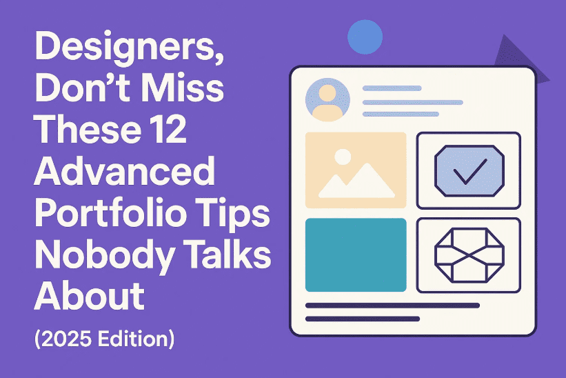
Whether you’re redesigning your portfolio or building it from scratch, there’s a high chance you’re overlooking some of the most powerful techniques to truly stand out in today’s saturated design market. Most portfolios follow the same patterns—show the work, write a few lines, link a “contact me” button—and hope clients will reach out. But 2025 is no longer the era for basic templates and passive storytelling.
If you want to actually convert views into real-world opportunities, clients, or even job offers, your portfolio needs more than just pretty pictures. It needs clarity, strategy, interactivity, and a sense of your personality. In this article, we’ll go through 12 deeply strategic, often overlooked tips to make your portfolio unforgettable.
Let’s get started with the first—and most ignored—feature.
🎯 1. Add Hover Tips and Footnotes That Reveal Process
Most designers showcase only the final version of their work—especially in branding or logo design. But here’s a little secret: clients love the why more than the what. They want to see how you think.
So before we dive into UI or layout advice, let’s focus on a feature that instantly adds trust and depth.
Try This:
- Add a hover interaction on a logo to reveal your pencil sketch or wireframe.
- Use micro footnotes beside typography that say, for example:
“This typeface was selected for better legibility among older users.”
These subtle additions serve two purposes:
- They reward engaged viewers (if someone is hovering, they’re already interested).
- They establish that you care about more than aesthetics—you solve real problems.
This is the silent trust-builder that many portfolios miss.
💬 2. Sprinkle Micro CTAs Throughout (Not Just at the Bottom)
Let’s move to the next missed opportunity—calls to action (CTAs). Most portfolios drop a lonely “Contact Me” button at the footer, expecting people to scroll down and take initiative.
Reality check: Many visitors bounce before they get to the bottom.
Instead, use contextual, micro CTAs like:
- After a case study:
“Want a brand this confident? Let’s talk.” - Beside packaging work:
“Need help with first impressions? Reach out.”
These aren’t pushy—they’re permission-based invitations. They align with the content people are already interested in and create multiple, natural entry points for action.
✍️ 3. Your Writing Is As Important As Your Visuals
Most junior portfolios overlook this. But in the real world, design decisions need strategic justification.


If you write:
“I picked this font because it looked nice.”
…you sound like a student.
Instead, write:
“This typeface improves scanability across mobile and print formats.”
It’s still true—but now it highlights your professional reasoning. Every sentence should position you as a problem-solver, not just a stylist.
Remember: your words can communicate value even when visuals fail.
🧭 4. Break Long Case Studies into Digestible Sections
So far, we’ve covered micro elements. Let’s now look at structure.
One of the biggest mistakes designers make is creating endless scrolling case studies. They lose rhythm, pacing, and attention.
Treat your portfolio like a visual carousel:
- Break it into sections: Problem → Solution → Result
- Use full-width imagery or swipeable containers (especially on Behance or personal sites)
- One idea per “slide” or screen
This builds narrative tension and rewards attention with clarity. Users scroll further because their brain is getting constant, easy-to-digest insights.
✨ 5. Add Micro-Movements and Subtle Interactions
Want your work to feel premium without redesigning everything?
Let’s move into the world of subtle motion. These are small animations that immediately elevate perceived quality.
Examples:
- A logo that fades in gently
- A menu that slides out with smooth easing
- A case study title that highlights on hover
- A blur effect that clears on scroll
Motion gives your portfolio a sense of tactility. It feels responsive, alive, and thoughtful.
🎧 6. Use Audio Strategically (But Carefully)
This one’s a bit controversial—but if done right, it’s magical.
Imagine showcasing a brand film or experience design and adding:
- Ambient background hum
- Water trickle sounds
- Soft clicks or transitions
Sound should be optional and ambient—not disruptive. It’s not about noise; it’s about depth.
Sound gives your work a mood, and when combined with motion, it transforms your portfolio from a scrollable archive into a cinematic journey.
📌 7. Add a “How I Work” Section with Actual Steps
Most designers forget to answer this fundamental question:
“What’s it like to work with you?”
Clients want to know your process—without jargon or fluff. Don’t just list services. Explain your typical workflow in 4–5 steps.
Example:
- Discovery → Ideation → Concept Refinement → Final Delivery
Add icons or illustrations. Or even better:
- Link real client projects to each stage.
- Show how a logo was refined across three iterations.
This proves you’re not just showcasing a result—you’re highlighting a repeatable, professional process.
🎥 8. Create a One-Minute Portfolio Tour (Perfect for LinkedIn or Email)
Let’s talk outreach. PDFs are cold. Text-only messages feel forgettable.
Instead, record yourself walking through your portfolio for 60–90 seconds.
How to Do It:
- Speak casually: “This was for a vegan café rebrand. Their issue was visual inconsistency, so I unified their assets across digital and print.”
- Use calm voice, simple screen-recorded cuts
- Show 3–5 projects max
Send this via LinkedIn or email when applying for roles or pitching to clients. It’s personal, polished, and stands out 10x more than an attachment.
🎨 9. Brand Your Portfolio Like a Client Project
Now this is a game-changer.
Your portfolio isn’t just a container for your work—it’s a reflection of your taste.
So instead of slapping your logo on a white site, do this:
Match your site’s vibe to your style:
- Edgy, kinetic designs → Use bold fonts, loud colors, glitch effects
- Calm, minimal work → Use muted tones, serif typography, and whitespace
Just like a fashion label, your portfolio should tell a story from the first scroll. The design IS the pitch.
💡 10. Design for Attention Flow: One Message Per Scroll
Your portfolio is competing with Instagram, Slack, emails, and countless tabs.
To win attention, design each scroll like a reward.
Use:
- One key message per screen
- Clean white space
- Smart scroll effects
- Section intros: “Here’s what we solved” or “How we got there”
This technique keeps the reader scrolling past the 30% mark, which is where most drop off.
🔄 11. Combine Case Studies with Real-World Context
Instead of just showing a mockup of packaging on a flat background, go further.
Add:
- Before/after comparisons
- Mockups on shelves or user hands
- Notes explaining manufacturing constraints, user research, or iteration cycles
Clients LOVE seeing you consider constraints—they don’t just want “dribble shots,” they want real impact.
🚀 12. Your Portfolio is Never Finished (And That’s a Good Thing)
Last but not least—your portfolio is a living document.
Treat it like your design playground. Test layouts. Update interactions. Refresh case studies with new footnotes.
If you haven’t updated your site in 6+ months, you’re missing chances to:
- Improve ranking (SEO)
- Impress returning visitors
- Reflect growth and new skills
Think of it as your ongoing product—not a one-time project.
❓Frequently Asked Questions
Q: How many projects should I showcase?
3 to 6 strong case studies are enough. Quality beats quantity.
Q: Should I use a template or custom design?
If you’re short on time, start with a template—but brand it fully. Eventually, build custom to stand out.
Q: Is Behance enough or should I make a website?
Behance is great for discovery, but a personal website shows initiative and allows full creative freedom.
Q: Should I show process even if it’s messy?
Yes! Raw process builds trust. Curate, but don’t sanitize everything.
Q: How long should each case study be?
Aim for 3–5 scrollable sections per project. Think storytelling, not resume.
Tags:
design portfolio tips, UX designer portfolio guide, freelance portfolio layout, UI case study writing, motion in portfolios, branding portfolio structure, hover effects portfolio, micro interactions design, graphic designer job tips, 2025 designer portfolio strategy
Hashtags:
#DesignPortfolio #UIUXTips #GraphicDesign #DesignerPortfolio2025 #BehanceTips #MotionDesign #CaseStudyTips #CreativeCareer #FreelanceDesign #PortfolioStructure #VisualStorytelling #DesignStrategy
Disclaimer:
This article is intended for educational and informational purposes only. Tools, frameworks, and platform features may change over time. All examples are generalized and should be adapted based on your personal design tone and client niche.
Design isn’t just about what people see—it’s about what they feel. If you apply even a handful of these strategies, your portfolio will do more than impress—it’ll connect, engage, and convert.
Now go design your future.