In recent years, dark mode has become a visual trend across apps, websites, and operating systems. While many people now prefer browsing in darker themes, traditional light mode still holds its place in web design, especially for content-heavy websites like blogs.
But which one is better for your blog? Should you switch to a sleek, dark theme or stick to the familiar white background?
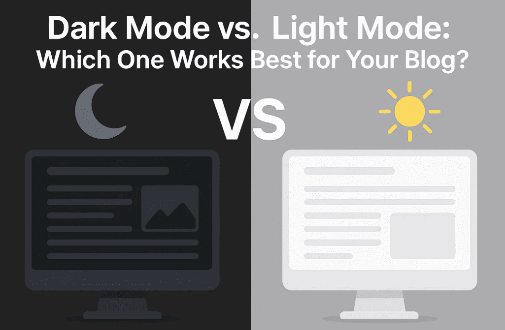
In this article, we’ll dive deep into the advantages and disadvantages of both modes, examine their effects on user experience, readability, SEO, and energy usage, and finally help you choose the right mode based on your target audience.
💡 What Is Light Mode?
Light mode uses dark text on a light background — usually black or dark gray text on white. This is the traditional and default theme in most websites and blogs.
✅ Pros of Light Mode:
- Readability: Excellent for reading long-form content like articles and blogs.
- Consistency: Matches printed materials and traditional design standards.
- SEO-Friendly: Light themes with proper contrast offer excellent crawlability and accessibility.
- Common User Expectation: Many visitors are still accustomed to light backgrounds.
❌ Cons of Light Mode:
- Eye Strain in Low Light: Can cause discomfort in dark environments.
- Harsh Brightness: May lead to fatigue for night-time readers.
- Battery Usage: Consumes slightly more power on OLED screens.
🌑 What Is Dark Mode?
Dark mode flips the contrast — light text on a dark background. It’s popular in mobile apps, developer tools, and modern UI designs.
✅ Pros of Dark Mode:
- Comfortable in Low Light: Reduces glare and eye fatigue at night.
- Battery Saving: On OLED and AMOLED displays, dark mode can save battery life.
- Modern Appeal: Sleek, stylish, and increasingly preferred by Gen Z and tech-savvy users.
- Focus-Friendly: Less visual distraction, which may enhance focus on text.
❌ Cons of Dark Mode:
- Poor Readability for Long Texts: Prolonged reading on dark backgrounds can be tiring.
- Accessibility Issues: Not all users with visual impairments find dark mode helpful.
- Color Contrast Challenges: Improper design can lead to low contrast and hard-to-read content.
🎯 Dark Mode vs. Light Mode: Head-to-Head Comparison
| Feature | Light Mode | Dark Mode |
|---|---|---|
| ✅ Readability | Better for long content | Better for short interactions |
| 🌙 Night-Time Comfort | Can be harsh | Much easier on eyes |
| 📱 Battery Efficiency (OLED) | Higher power usage | Saves power on supported devices |
| 🧑🤝🧑 Accessibility | Works well for most users | Not ideal for dyslexic users |
| 👓 Visual Fatigue | More in dark environments | More in daylight or for long text |
| 💻 SEO Compatibility | Great if contrast is maintained | Can be tricky if contrast is low |
| 🖌️ Design Aesthetics | Classic and clean | Modern and minimalistic |
💬 What Do Users Prefer?
User preference is often contextual:
- Daytime Readers & Professionals: Usually prefer light mode.
- Night Owls & Developers: Tend to favor dark mode.
- Elderly or Visually Challenged Readers: Often prefer light backgrounds with high contrast.
For blogs with heavy reading, light mode usually wins in terms of comfort and legibility.
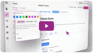
🔧 Should You Add Both? (Best Practice)
Yes! If you want the best of both worlds:
- Use a theme with toggle support between dark and light modes.
- Auto-adjust based on the user’s system settings using
prefers-color-schemein CSS. - Ensure high contrast, no matter the mode, to meet accessibility standards (WCAG 2.1).
🧪 What Google Recommends
From an SEO and accessibility standpoint:
- Google prioritizes readability and mobile-friendliness.
- Dark mode is not a ranking factor, but accessibility and UX are.
- Using proper HTML semantics, contrast, and legible fonts is more important than the color scheme itself.
💻 How to Add Dark Mode Support to Your Blog
If you’re on WordPress:
- Use themes like Astra, GeneratePress, or Neve with dark mode support.
- Plugins like WP Dark Mode allow readers to toggle modes easily.
For custom websites:


@media (prefers-color-scheme: dark) {
  body {
    background-color: #121212;
    color: #ffffff;
  }
}
This CSS snippet automatically applies dark mode if the user prefers it.
🏁 Final Verdict: Which Is Best for Your Blog?
| Your Blog Type | Recommended Mode |
|---|---|
| News, Tutorials, Long Articles | Light Mode (Default) |
| Portfolio, Tech, Code Snippets | Dark Mode (or Toggle Option) |
| General Blog | Light + Optional Dark Mode |
For blogs, especially those that publish detailed content, tutorials, or long-form guides — light mode is generally more reader-friendly. However, offering a dark mode toggle enhances user experience and personalization.
💬 Frequently Asked Questions
❓ Can dark mode improve SEO?
Not directly. SEO depends on structure, speed, mobile-friendliness, and content quality — not color mode.
❓ Is it okay to use dark mode by default?
Yes, if your blog caters to developers, gamers, or night readers. But always test readability and accessibility.
❓ Do all browsers support prefers-color-scheme?
Yes, modern browsers like Chrome, Safari, Firefox, and Edge fully support it.
📢 Pro Tip:
Use Google Lighthouse or WAVE Accessibility Checker to test your blog in both modes for contrast and readability.
📱 Ready to Upgrade Your Reading Experience?
Choose a mobile device that supports seamless dark/light mode switching:
- 🔹 Buy Android Smartphones on Amazon [Affiliate link]
- 🍎 Explore Apple iPhones on Amazon [Affiliate link]
🏷️ Tags:
dark mode, light mode, blog design, user experience, blog theme, accessibility, SEO tips, readability, wordpress tips, UI design, prefers-color-scheme
📢 Hashtags:
#DarkMode #LightMode #BlogDesign #UXDesign #Accessibility #WordPressTips #WebDesign #SEO #MobileExperience #DarkVsLight
Let your users choose what works best for their eyes — and your blog will thank you with better engagement and retention!