Microsoft is rolling out significant updates to the Windows 11 Start Menu, and users are seeing a drastic redesign that has sparked both curiosity and controversy. This article walks you through the key changes, how to navigate the new layout, and what to expect in the upcoming Windows 11 versions (23H2 and 24H2).
The New Start Menu: A Drastic Overhaul
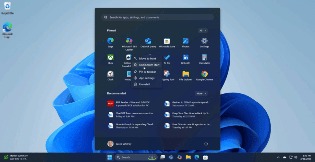
The redesigned Start Menu in Windows 11 is massive and takes a bold step away from the minimalist style many users were just getting used to. The new layout introduces category sections at the bottom, with pinned apps at the top, resulting in a much taller and visually dense menu.
Key Visual Changes:
- A larger layout that takes up more screen space.
- Categories to organize apps.
- An expanded recommended section that includes recent documents and apps.
- Lack of resizing options for the menu itself.
This shift appears to be Microsoft’s attempt to offer more customization and quick access to different parts of your system. However, the bulkiness and cluttered appearance may not sit well with everyone.
Using Categories to Organize the Start Menu
One of the central new features is the Category Section, which allows users to group apps under labeled categories. You can:
- Add more categories at the bottom.
- Pin specific apps into each category.
- Pin categories to the top of the Start Menu.
To control visibility, a toggle (rocker) button at the top allows you to “Show All” or “Show Less” in the pinned section.
While this feature adds more control, it can also make the Start Menu appear more cluttered if not managed properly.
Recommended Section: Still Present (But Optional)
The Recommended Section remains in the Start Menu and auto-populates with:
- Recently opened documents.
- Recently installed or used apps.
While you cannot uninstall this section entirely, you can toggle it off through settings to reduce visual clutter.
To disable it:
- Open Settings > Personalization > Start.
- Turn off options like:
- Show recently added apps
- Show most used apps
- Show recently opened items in Start, Jump Lists, and File Explorer
This will clean up the Start Menu and reduce distraction.
Start Menu Layout Modes: Named List or Grid
Users can switch the layout of pinned items between:


- Named List (organized, linear list)
- Named Grid (block-based grid)
This layout can help streamline visibility and access, especially for users who prefer a more structured interface.
Adding Useful Functional Buttons
Windows now allows users to add system-level buttons, like:
- End Task (inside the Developer settings)
This can be helpful for power users who want fast access to development and task-related controls directly from the Start Menu.
Issues with Clutter and Usability
Although the redesign adds more options and tools, many users have expressed concerns:
- The menu is visually overwhelming, especially when all sections are enabled.
- Adding categories, recommended items, pinned apps, and system tools all in one place creates a cluttered interface.
- Resizing is not yet supported, limiting flexibility.
Additionally, connecting a smartphone or other device will expand the Start Menu further, making it occupy almost the entire screen in some cases.
Customizing the Taskbar
There’s also a minor update related to the Taskbar:
- You can now reduce icon sizes.
- Note: This does not resize the taskbar itself, just the icons.
To access this:
- Go to Settings > Personalization > Taskbar
- Enable smaller icons through Taskbar behaviors.
Insider Preview Build and Availability
The updated Start Menu is part of Windows Insider Preview Build 22635.5170. It will roll out in:
- Windows 11 23H2
- Windows 11 24H2
You can view full release notes on Microsoft’s official site:
👉 Windows Insider Blog
The changes include:
- A revamped Start Menu
- File Explorer bug fixes
- General UI and usability improvements
Final Thoughts
Microsoft’s redesigned Start Menu for Windows 11 aims to provide more organization and control to users, but the result may not appeal to everyone. While the category system and functional tools are a step forward in customization, the lack of layout flexibility and the overwhelming UI might leave some users dissatisfied.
Our Take:
The new Start Menu offers more features but at the cost of simplicity. Power users may appreciate the deeper control, but casual users might find the new layout overly complex and cluttered.
Let us know what you think about the new Start Menu in the comments below. Do you love the new features, or does the layout feel like a misstep?
Tags:
Windows 11, Start Menu, Windows 11 update, Windows Insider, Windows 11 personalization, Microsoft Windows changes, 23H2, 24H2, Windows customization, Windows usability
Hashtags:
#Windows11 #StartMenu #WindowsUpdate #WindowsInsider #Microsoft #WindowsFeatures #TechNews #WindowsTips #UserExperience #OSDesign
Disclaimer:
This article reflects the author’s opinions based on the current Windows 11 Insider Preview build and may not represent the final release features. Always refer to Microsoft’s official documentation for the latest updates and functionality. Changes mentioned here are subject to updates or reversal by Microsoft before public release.