This article is a part of “The 12 Golden Rules of Desktop Publishing Every Designer Should Know“
Ever found yourself rereading a sentence multiple times, even though the words were simple? It might not be your fault — it might be the line length.
In desktop publishing, one of the most overlooked yet critical aspects of readability is the relationship between how long your lines are and how big your text is. Get this wrong, and your reader will either get bored… or get a headache.
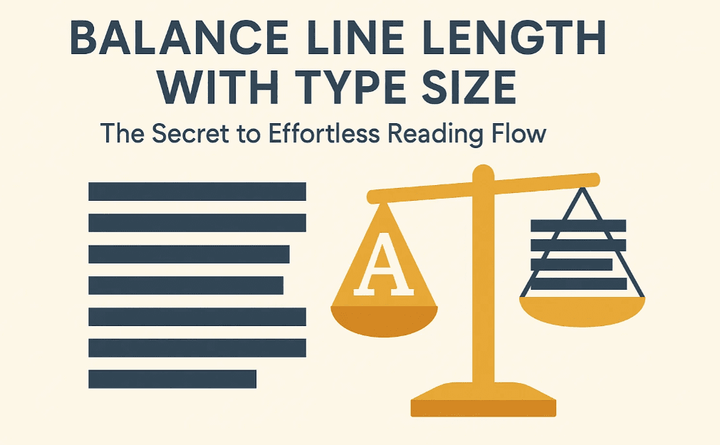
Let’s break down how to balance line length and type size so that your layout reads smoothly — like butter.
📏 Why Line Length Matters
Your brain reads in visual chunks, not individual words. When lines are too long, your eyes get lost trying to jump from the end of one line to the start of the next. When they’re too short, your reading rhythm is interrupted.
🚫 Too Long:
- Tiring for the eyes
- Easy to lose your place
- Slower reading speed
🚫 Too Short:
- Creates unnecessary line breaks
- Visually choppy
- Breaks reading flow
🎯 The goal is to find the sweet spot — a line length that feels natural and lets your eyes glide across the page effortlessly.
🧮 Two Proven Formulas for Ideal Line Length
There’s no one-size-fits-all solution, but these two time-tested formulas will help you calculate the optimal line length based on your type size:
1️⃣ Alphabet-and-a-Half Rule
This rule suggests that a line should be about 39 characters long (including spaces). That’s roughly the length of one and a half alphabets.
✔️ Works well for a quick visual estimate
✔️ Best for narrow columns, sidebars, or mobile screens
2️⃣ Points-Times-Two Rule
Take the font size in points, and multiply it by 2 to get your ideal line length in picas (1 pica = approx. 1/6 inch).
Example:


- 12pt font × 2 = 24 picas = 4 inches
- 10pt font × 2 = 20 picas = 3.33 inches
✔️ Perfect for print layouts
✔️ Helps balance dense and airy designs
🧠 Practical Tips for Balancing Type and Line Length
- Use narrower columns for small fonts (e.g., sidebars, footnotes)
- Use wider columns for larger fonts (e.g., headlines, pull quotes)
- Adjust font size OR column width — not both — to fix layout problems
- Watch out for justified text in long lines — it often causes ugly spacing
📋 Real-World Comparison
| Font Size | Ideal Line Length (Points x 2 Rule) | Use Case |
|---|---|---|
| 10 pt | 3.3 inches (20 picas) | Book interiors, legal docs |
| 12 pt | 4 inches (24 picas) | Newsletters, reports |
| 14 pt | 4.6 inches (28 picas) | Manuals, brochures |
| 16 pt+ | 5.3 inches (32 picas) or more | Posters, headlines, callouts |
📐 What About Web or Digital Layouts?
For web or responsive design:
- Aim for 50–75 characters per line (including spaces)
- Use CSS media queries to adapt font and layout size across devices
- Mobile: Keep lines shorter (35–45 characters)
- Desktop: Slightly wider is acceptable, but don’t overdo it
🧰 Designer’s Checklist
✅ Adjust your layout or font size to meet the ideal line length range
✅ Use tools like InDesign’s measure tool or online calculators
✅ Don’t forget letter spacing and line height (leading) also affect flow
✅ Test print or preview your layout — what looks good on screen might not on paper
❓ Frequently Asked Questions
🔹 What if I can’t get the perfect length due to design constraints?
Close is good enough. As long as your lines aren’t too short (under 30 characters) or too long (over 90 characters), you’re generally safe.
🔹 Do these rules apply to all fonts?
Not exactly. Some fonts are wider (like Verdana), others narrower (like Times New Roman). Always test a paragraph before finalizing layout.
🔹 How do I fix text that’s too hard to read?
Try:
- Increasing or decreasing column width
- Adjusting font size
- Increasing line height (leading)
- Breaking the content into multiple columns
✅ The Bottom Line
Design is about harmony — and the relationship between font size and line length is a huge part of that harmony.
🎯 Shorter line = smaller font
🎯 Longer line = bigger font
🎯 Get it right, and your readers won’t even notice — they’ll just keep reading
🏷️ Tags:
desktop publishing, line length, font size, readability, typography rules, layout design
#Hashtags:
#DesktopPublishing #TypographyTips #ReadabilityMatters #DesignRules #LineLength #TypeSizeBalance
📖 Next Rule → Use All Caps with the Right Fonts


