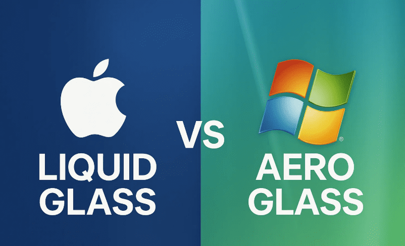
In 2025, Apple unveiled its boldest design refresh in years with the introduction of iOS 26 and macOS 26—a visually rich interface called Liquid Glass. With glossy, translucent panels and depth-rich icons, Apple’s new UI immediately sparked comparisons to a long-forgotten design language: Microsoft’s Aero Glass, made famous by Windows Vista in 2007.
So, is Apple simply recycling Windows’ mid-2000s visual ideas for Gen Z? Or is there more going on beneath the shiny surface?
Let’s dig deep into the design history, evolution of visual elements, technology constraints, and the nostalgia cycle that just might explain Apple’s move back to glass.
💎 A Glimpse at Liquid Glass: Apple’s New Aesthetic
Apple’s Liquid Glass UI in iOS 26 and macOS 26 features smooth, translucent surfaces, depth-enhanced icons, and dynamic visual feedback that reacts to motion and light. It’s glossy, reflective, and designed to blur the line between hardware and software—both metaphorically and literally.
But if you used computers in the 2000s, this might feel… familiar.
🖼️ Throwback to Windows Vista and Aero Glass
Let’s rewind. When Windows Vista launched in 2007, it came packed with Aero Glass—a frosted-glass UI with glowy, translucent window frames and animated effects.
So what did Aero Glass bring to the table back then?
- Translucent window borders with live blur.
- Glossy, 3D buttons embedded in glowing panes.
- Light-beam reflections and subtle animations.
- A system requirement spike, thanks to new GPU demands.
The goal? To show off the power of modern GPUs at the time, using effects made possible by pixel shaders.
🧠 Comparing Design Philosophies
So far, so good. Both Apple’s Liquid Glass and Microsoft’s Aero Glass are about showcasing translucent layers, but they diverge in intent and execution.
Let’s move to a side-by-side comparison of both UI styles:
| Feature | Aero Glass (Vista) | Liquid Glass (macOS 26 / iOS 26) |
|---|---|---|
| Transparency | Window frames only | Buttons, notifications, and full components |
| Animation | Minimal, static blur | Dynamic lighting, motion-based depth |
| Depth | Flat with glassy borders | Layered UI, 3D light reflection |
| Icon Style | Glossy skeuomorphic | Abstract glass tiles |
| GPU Usage | High for time | Optimized for modern mobile GPUs |
| Resolution Support | 80-90 PPI displays | Retina / high-DPI screens |
🧬 The Evolution of UI: From Skeuomorphism to Flat and Back Again
In the early 2000s:
- Apple launched Aqua with Mac OS X, a “lickable” UI with bulbous icons.
- Microsoft responded with Aero Glass in Vista.
- Both drew heavily from real-world textures and 3D design.
Then came the flat era:
- Apple’s iOS 7 (2013) and macOS Yosemite (2014) ditched skeuomorphism.
- Metro UI in Windows 8 and Google’s Material Design led the charge.
And now? We’re swinging back to depth and realism, but modernized.


🌀 Is It Just Nostalgia?
That mid-2000s aesthetic—Vista’s floating icons, MSN’s 3D animations, Xbox 360’s Blade UI—was the digital wallpaper of Gen Z’s childhood. Now grown up and spending money, this demographic craves more than clinical flatness.
Apple, perhaps sensing that nostalgia, has crafted Liquid Glass not just as a tech flex, but as a design callback—one polished and evolved for the modern era.
🧠 What Makes Liquid Glass Different?
Let’s appreciate the modern enhancements Apple brings:
- Motion-reactive icons with dynamic lighting.
- Subtle parallax effects based on gyro sensors.
- 3D shading on icon layers.
- Higher-res details, especially on Retina displays.
- Smart blurs with actual depth perception.
This isn’t just transparent frosting. It’s real-time physics-based rendering tuned to user motion and ambient light.
🔍 So Is Apple Copying Microsoft?
Let’s be fair. While Aero Glass laid groundwork, Apple’s Liquid Glass:
- Is more responsive.
- Leverages modern GPUs and sensor data.
- Integrates across iOS, macOS, and VisionOS.
- Adds customizable overlays for icons in dark/light mode.
Yes, it’s a callback—but not a copy.
🤖 Google’s Material Design: The Other Side of the Coin
While Apple embraces semi-3D depth and liquid overlays, Google’s Material You / Material 3 still leans flat, colorful, and grid-based. It’s expressive, but minimal.
That contrast will define design trends in the next few years:
- Will consumers choose Apple’s layered realism?
- Or stick with Google’s vibrant simplicity?
Only time (and user adoption) will tell.
📈 Final Thoughts: The Design Cycle Comes Full Circle
Apple’s Liquid Glass is not just a design gimmick—it’s a fusion of nostalgia, modern hardware, and responsive design trends. It’s fluid, animated, deeply layered—everything the flat era tried to simplify.
And while some may roll their eyes at Apple “reinventing Vista,” the truth is: this is what software design has always been about—building upon ideas, reinventing them for new generations, and pushing the boundaries of hardware through UI.
We’re in an exciting phase again, where design is fun, detailed, and yes—lickable.
❓ Frequently Asked Questions
❓ Is Apple’s Liquid Glass a copy of Aero Glass?
Not exactly. While both are translucent designs, Liquid Glass uses real-time animation, 3D lighting, and responsive feedback far beyond Vista’s capabilities.
❓ Will Windows ever bring back Aero Glass?
So far, no official plans. Microsoft seems committed to Fluent Design and rounded corners, but the community still wants a modern Aero return.
❓ What influenced Apple’s return to glass?
Likely a mix of nostalgia, hardware maturity, and VisionOS’s layered UI style crossing into desktop and mobile.
🔗 Further Reading
🏷️ Tags:
apple liquid glass, macos 26, ios 26, aero glass, windows vista, skeuomorphism, flat ui, design trends 2025, apple design language, nostalgia ui, material design
🔖 Hashtags:
#LiquidGlass #macOS26 #iOS26 #AeroGlass #WindowsVista #UIDesign #AppleVsMicrosoft #DesignEvolution #FlatUI #ModernUI #FrutigaEra
Disclaimer: This article is for informational and commentary purposes only. Product visuals and features are subject to change in beta software. Apple, Microsoft, and Google are registered trademarks of their respective owners.