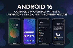
Android 16 has finally been unveiled, and it’s already making waves for its refined user interface, bold visual tweaks, and smart functionality upgrades. From redesigned quick settings to expressive animations, this release feels like the spiritual successor to Android 12 — a version that redefined Android’s visual identity.

Let’s take a detailed look at what Android 16 brings to the table and why you should be excited.
A Redesigned Quick Settings & Notification Panel
One of the most eye-catching elements in Android 16 is the overhauled quick settings and notification shade. The updated blur effect adds depth and sophistication, while the tile shapes now change dynamically based on toggle state — switching from pill-shaped to rounded rectangles when active.
You’ll also notice:
- Bouncy on/off animations that add a playful and responsive vibe.
- The expand arrow now points downward instead of to the right.
- Unified swipe gesture: Unlike some OEMs, Google maintains a single swipe to access both quick settings and notifications, which keeps things fast and intuitive.
The brightness slider has also been redesigned. It now features a rounded rectangle with a precision handle, enabling finer control over screen brightness.
Customizable Tile Layouts & New Editing Interface
Tile sizes are now more flexible:
- 1×1 tiles show just the icon and act as a toggle.
- 2×1 tiles display both an icon and a label, allowing users to toggle or expand via the label.
The quick settings edit page has been visually enhanced:
- Top half shows active tiles.
- Bottom section features categorized, inactive tiles for easy browsing.
- Add/remove buttons and a resizable handle for larger tiles.
- A new undo button lets you quickly revert recent changes — a thoughtful touch.
Status Bar and Icon Tweaks
Android 16 updates the status bar with:
- Bolder fonts for better readability.
- New signal bar indicators replacing traditional icons.
- A horizontal battery icon that now includes the percentage inside.
These updates give the interface a cleaner, more modern look.
Enhanced Notification Experience
The notification panel has been revamped with smoother dismiss animations that include subtle haptic feedback. Other noticeable changes:
- Notification history button is now an icon.
- “Clear All” button is larger and centered.
- A new settings icon next to it may provide quick notification customization.
Expressive System-Wide Animations
Animations in Android 16 feel more dynamic and cohesive. Key areas include:


- Recent apps screen with bounce-like half-swipe gestures.
- Transitions in apps such as Google Photos, Gmail, and Fitbit now reflect the system’s expressive animation style.
- Material You enhancements continue with updated colors and responsive UI elements in Google’s core apps.
New Font System & UI Design Updates
Fonts are getting an upgrade too. In apps like Google Messages, users may spot multiple fonts used in the same conversation, hinting at deeper personalization or contextual styling.
Apps like Google Messages, Clock, and Gemini are getting refreshed interfaces with:
- A new Gemini chip in pill shape.
- A revamped alarms interface.
- A multi-timezone clock widget labeled “Best Times” — likely a feature aimed at global users or travelers.
Media Controls Refined
Media playback controls have also received a facelift:
- Play/pause buttons are updated.
- Shuffle and like buttons moved to the left.
- Output switcher is now smaller and more integrated.
- Navigation buttons (next/previous) are more rounded with a filled style.
New Lock Screen & Live Updates
A major addition to the lock screen is support for live updates from third-party apps — similar to Apple’s Live Activities. These can show real-time info from apps like Uber Eats directly on the always-on display or lock screen.
Key features include:
- Collapsed pill in status bar showing app icon and ETA.
- Tapping it reveals a detailed card for expanded information.
The At a Glance widget is now beside the clock, not below it. This change, along with a larger clock and blurred background for the PIN pad, contributes to a more unified look.
What Else is New?
- Material 3 Expressive theme support continues to evolve, bringing more visual consistency and flair across system apps.
- Expect more interactive and personalized features as Android 16 develops further.
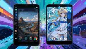
Wallpapers with Theme Control
If you’re eager to complement Android 16’s look with matching wallpapers, check out the Wallpapers by InDepth Tech Reviews app. It includes:
- A wide range of high-quality wallpapers.
- Separate editing panels for lock screen and home screen, giving you precise customization control.
Final Thoughts
Android 16 feels like a bold step forward. It refines what worked in Android 12 and 15 while adding new features that prioritize usability, responsiveness, and customization. The expressive animations, smarter notification controls, and enhanced lock screen experiences make this one of the most exciting Android updates in years.
Stay tuned for future updates as Google continues to reveal even more features in the developer previews and beta builds.
Tags:
android 16, android 16 features, android 16 redesign, android 16 quick settings, android 16 notifications, android 16 animations, pixel ui, material you, live activities android, android customization, android beta, android news
Hashtags:
#Android16 #MaterialYou #AndroidUpdate #PixelUI #AndroidCustomization #TechNews #MobileOS #GoogleAndroid #AndroidFeatures #LiveActivities #AndroidTips
Let me know if you want a comparison article with Android 15 or a tutorial post on how to try the Android 16 developer preview on your Pixel device.