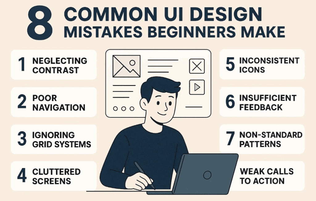
Designing a great user interface (UI) isn’t just about making things look pretty. It’s about usability, clarity, and consistency. Over the years, many beginners fall into common UI traps that make their designs look amateur and difficult to use.
In this detailed blog post, we’ll walk you through eight of the most common UI design mistakes beginners make—with practical steps and examples on how to fix them. Whether you’re a UI/UX designer, front-end developer, or app builder, these lessons will help you instantly improve your designs.
🎯 Mistake #1: Ignoring User Flow
Many designers focus too much on individual screens and not enough on the overall user flow.
Example:
In a recipe app, there’s an allergy screen with 6 options. But:
- No search bar for other allergies
- No skip button if the user has no allergies
This creates a dead-end experience for users.
Solution:
- Sketch your flows beforehand (even on paper)
- Always offer an escape or skip option
- Include search and navigation elements
- Don’t forget micro-interactions like hover states or button feedback
🎨 Mistake #2: Overusing Visual Effects
When you’re starting out, it’s tempting to add gradients, shadows, and glows everywhere.
Example:
A blue-to-green gradient that feels chaotic. Drop shadows that look heavy and unnatural.
Solution:
- Stick to subtle gradients using shades of the same color
- Adjust shadows by changing their color to gray, increasing blur, and reducing opacity
- Often, the cleaner the design, the more professional it looks
📐 Mistake #3: Poor Spacing and Layout
Beginner designs often suffer from cramped layouts and uneven spacing.
Solution:
- Use grids (e.g., 3-column or 2-column layouts)
- Apply auto layout tools like those in Figma for consistent spacing
- Increase vertical padding on mobile to improve readability
- Leave white space—it helps group elements logically and makes designs feel less overwhelming
🔁 Mistake #4: Inconsistent Components
Inconsistent UI elements can make your app feel chaotic.
Common Mistakes:
- Different corner radiuses on buttons
- Same buttons (e.g., “Back” and “Skip”) styled differently
- Variations of the same component throughout the design
Solution:
- Standardize corner radius (e.g., 10px for all small buttons)
- Use design systems with shared styles, variables, and components
- Make similar elements look exactly the same, except for text if needed
🧭 Mistake #5: Poor Use of Icons
Icons are often underused, overused, or inconsistently styled.
Examples:
- Missing icons on recipe cards
- Mismatched line thickness or styles
- Icons without labels that confuse users
Solution:
- Add icons where they help scannability (like on recipe cards)
- Use consistent icon libraries like:
- Use SVGs for better scalability and editing
- For unknown icons, add tooltips for clarity
- You can use different icon styles—but only if they’re used in visually separated sections
🧹 Mistake #6: Redundant UI Elements
Redundant elements make your UI cluttered and overwhelming.


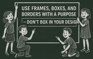


Example:
- Arrows on swipeable mobile cards
- Decorative strokes around containers that don’t serve a purpose
Solution:
- Remove unnecessary icons or shapes
- Use color dimming instead of outlines for better contrast without visual noise
- Always ask: Does this element help or distract the user?
🕹️ Mistake #7: Lack of Interactive Feedback
Interactive feedback is often forgotten, leaving users confused.
Examples:
- Buttons that do nothing when clicked
- Save icons with no feedback
- Long screen loads without any indication
Solution:
- Show loading indicators or gray-out buttons while waiting
- Add micro-interactions, like a red dot on the save tab when a recipe is saved
- Focus on user confirmation—let them know their action worked!
📊 Bonus Mistake #8: Over-Designed Charts
Charts should present data clearly, not just look pretty.
Bad Example:
- Rounded tops on bars with no axis
- 16 bars for 7 days—confusing and meaningless
Good Example:
- Clean layout
- Properly labeled axes
- Relevant data that’s easy to scan
Always remember: Clarity over aesthetics, especially for data visualization.
🙋 Frequently Asked Questions
❓ Q: What design tool is best for beginners?
A: Figma is one of the best UI/UX design tools for beginners—it’s free, browser-based, and has great plugin support.
❓ Q: How can I maintain consistency in a large project?
A: Use a design system with components, shared styles, and variables. Figma makes this easy through Design Libraries.
❓ Q: How many icons should I use?
A: Use icons where they aid comprehension, but avoid redundancy. When in doubt, include labels or tooltips.
📌 Final Thoughts
Design is a learning process—and making mistakes is part of it. But when you know what to look out for, you can avoid rookie errors that make your design feel unprofessional.
Let’s recap the 8 biggest UI design mistakes to avoid:
- Poor user flow
- Overuse of effects
- Tight spacing
- Inconsistent components
- Icon mismanagement
- Redundant UI elements
- Lack of feedback
- Over-designed charts
Focus on clarity, consistency, and user empathy, and your UI will naturally improve.
🔖 Tags
UI design mistakes, beginner UI tips, Figma UI guide, app redesign tutorial, design consistency, mobile UI design, microinteractions, icon design, auto layout, chart design tips
📢 Hashtags
#UIDesign #UXTips #DesignMistakes #FigmaTutorial #AppRedesign #UIForBeginners #MobileDesign #DesignConsistency #MicroInteractions #IconDesign
Disclaimer: This article is for educational purposes only and may contain affiliate links. Always evaluate plugins, design systems, and third-party resources based on your project requirements.