Typography is the backbone of great design. Whether you’re designing a poster, website, brochure, or social media post, how your text looks plays a crucial role in catching attention and conveying information. In this article, we’ll explore five professional typography tips that every graphic designer should follow to make their designs stand out and look more polished.
🖋 Tip 1: Make Your Title 2.5 Times Larger Than the Subtext
One of the most common mistakes beginners make is using similar font sizes for titles and subtitles. To make your title visually distinct and professional, always set it 2.5 times larger than your subheading or body text.
Example:
If your subheading is 20 pt, your title should be 50 pt.
You can calculate this quickly by multiplying:
20 * 2.5 = 50
This helps in creating a clear visual hierarchy.
Also, use bolder font weights (like Bold or Black) for titles, and regular or medium weights for the subtitle below to enhance contrast and readability.
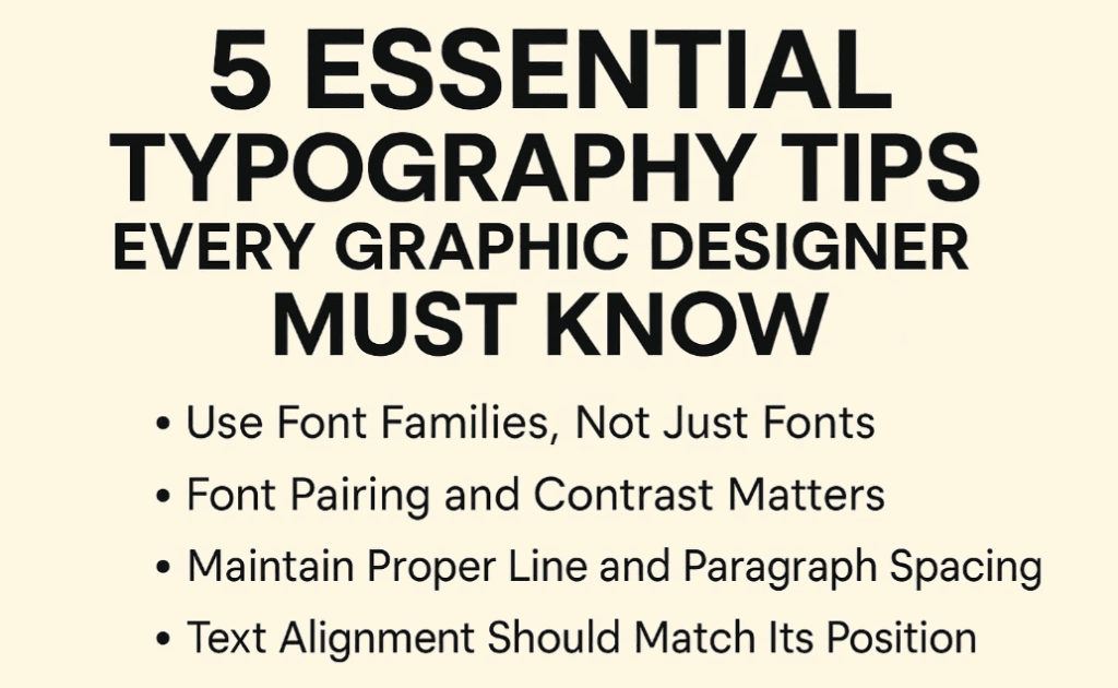
🖋 Tip 2: Use Font Families, Not Just Fonts
Avoid using too many different fonts in a single design. Instead, download and use font families that offer multiple weights and styles (e.g., Light, Regular, Bold, Black, etc.).
Recommended Font Example:
Roboto – A versatile typeface with full family support.
By using a single font family, you can create consistency and versatility without looking repetitive. For instance, use Roboto Bold for titles and Roboto Light for content—it maintains design coherence.
🖋 Tip 3: Font Pairing and Contrast Matters
Effective font pairing improves visual balance and readability. Pairing a Sans Serif font (like Roboto or Montserrat) with a Serif font (like Times New Roman or Merriweather) adds contrast that is pleasing to the eye.
Font Pairing Examples:
- Title: Roboto Bold (Sans Serif)
Subtitle: Times New Roman Regular (Serif) - Title: Script font (like Pacifico)
Subtitle: Roboto Regular (Sans Serif)
Rule of Thumb:
If your heading is a decorative or script font, pair it with a clean sans serif font for the subtitle or paragraph. This ensures clarity without losing creativity.
🖋 Tip 4: Maintain Proper Line and Paragraph Spacing
Spacing between lines (line-height) and between paragraphs is key to a readable layout. Too much or too little space can make your design look cluttered or disjointed.
Pro Tips:
- For normal paragraph text, use a line-height of 1.4 to 1.6 times the font size.
- Use sufficient spacing between paragraph blocks.
Example: If you’re adding contact details or call-to-action buttons, ensure there’s enough space between text blocks and elements to make each item stand out.
Proper spacing not only improves legibility but also gives your design a clean and organized appearance.
🖋 Tip 5: Text Alignment Should Match Its Position
Many designers misalign text relative to its placement on the canvas. This breaks the flow and affects visual appeal.
Follow This Rule:
- If the text is placed left, align it to the left.
- If it’s in the center, center-align it.
- If it’s on the right, align it to the right.
Consistency in alignment creates a structured layout. Random alignment leads to design chaos. Tools like Adobe Illustrator, Photoshop, or Figma allow you to easily manage alignment properties with smart guides and snapping features.
👨🏫 Frequently Asked Questions
Q1: How many fonts should I use in one design?
A: Stick to 1 or 2 fonts. If needed, use different styles from the same font family. Never exceed 3 fonts to avoid clutter.
Q2: Can I mix script and serif fonts?
A: Yes, but with contrast and caution. Use script fonts for headings or highlights only, paired with simple sans-serif or serif fonts for readability.
Q3: How do I know if spacing is too much or too little?
A: Zoom out to see the overall layout. If elements feel jammed or floating awkwardly, adjust spacing. Maintain consistent gaps across the design.
✅ Final Thoughts
By implementing these five typography techniques, your designs will appear more professional, organized, and aesthetically pleasing. Typography is more than just choosing a font—it’s about structure, hierarchy, contrast, and readability. Keep practicing these principles and your visual communication will drastically improve.
🏷️ Tags:
typography tips, graphic design, font pairing, text alignment, design hierarchy, spacing in design, visual design, title design, font family usage
🔖 Hashtags:
#TypographyTips #GraphicDesign #FontPairing #TextAlignment #DesignTutorial #TypographyBasics #VisualDesign #DesignTips #AdobeIllustrator
📌 Disclaimer:
This article is intended for educational and informational purposes for aspiring designers and professionals. Always ensure that the fonts you use in your commercial designs are properly licensed. Use fonts from trusted sources like Google Fonts, Adobe Fonts, or other verified providers.
Let your designs do the talking—with typography that communicates clarity and confidence!
