Graphic design is more than just aesthetics—it’s about communicating effectively through visuals. While there are 12 core principles of graphic design, mastering just four key principles can significantly elevate your work, whether you’re a beginner or an expert.
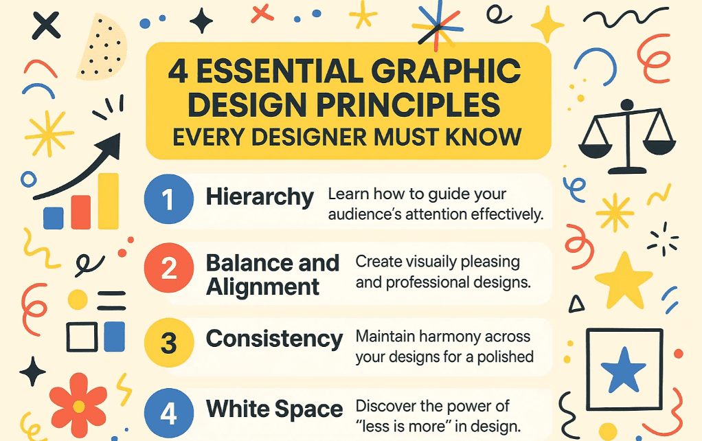
In this article, we’ll explore these four essential principles that professional designers use instinctively in every project. By applying these, your designs will look polished, intentional, and professional.
1. Hierarchy: Guiding the Viewer’s Eye
What is Hierarchy?
Hierarchy refers to arranging elements in a way that indicates importance. It helps guide the viewer’s attention to the most critical information first.
Why is Hierarchy Important?
- Ensures the key message stands out.
- Improves readability and user experience.
- Helps in brand communication (e.g., highlighting a sale vs. brand identity).
How to Apply Hierarchy?
- Size & Weight: Larger, bolder text grabs attention first.
- Placement: Important elements should be at the top or center.
- Color & Contrast: Bright or contrasting colors draw the eye.
Example:
If a client wants to highlight a sale, the discount percentage should be the largest element. If they want to emphasize their brand, the logo or brand name should dominate.
2. Balance & Alignment: Creating Visual Harmony
What is Balance & Alignment?
Balance ensures that no single element overpowers the design, while alignment keeps everything organized and cohesive.
Why is Balance Important?
- Prevents designs from looking cluttered or chaotic.
- Makes layouts visually pleasing and professional.
How to Achieve Balance?
- Symmetrical Balance: Mirror elements on both sides (formal look).
- Asymmetrical Balance: Different elements balance each other (modern look).
- Grid Systems: Use guides in tools like Adobe Photoshop or Illustrator for alignment.
Common Mistake:
Ignoring alignment leads to uneven spacing, making designs look amateurish.
3. White Space: The Power of Breathing Room
What is White Space?
White space (or negative space) is the empty area between elements. It’s not just “blank space”—it’s a crucial design tool.
Why is White Space Important?
- Enhances readability and focus.
- Makes designs look clean and sophisticated.
- Prevents visual overload.
How to Use White Space Effectively?
- Padding: Add space around text and images.
- Margins: Keep content away from edges.
- Grouping: Separate different sections clearly.
Example:
Compare a crowded flyer vs. one with proper spacing—white space makes the latter more appealing.
4. Consistency: Building a Cohesive Brand Identity
What is Consistency?
Using uniform styles (fonts, colors, spacing) across all designs to create a recognizable brand.
Why is Consistency Important?
- Strengthens brand recognition.
- Makes designs look professional and intentional.
How to Maintain Consistency?
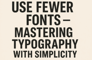
- Limit Fonts: Use 2-3 fonts max (e.g., one for headings, one for body text).
- Color Palette: Stick to brand colors.
- Design Templates: Reuse layouts for social media posts, ads, etc.
Pro Tip:
Brands like Coca-Cola and Apple use consistency to make their designs instantly recognizable.
FAQs on Graphic Design Principles
Q1. Can I break these design rules?
Yes, but only intentionally. Once you master these principles, you can experiment creatively.


Q2. Which tools help apply these principles?
Q3. How do I practice these principles?
- Redesign existing ads while focusing on hierarchy.
- Use grid systems for alignment.
- Experiment with white space in layouts.
Final Thoughts
By mastering hierarchy, balance & alignment, white space, and consistency, your designs will instantly look more professional. These principles are non-negotiable in high-quality graphic design.
Start applying them today and see the difference!
Tags:
Graphic Design, Design Principles, Visual Hierarchy, Balance in Design, White Space, Brand Consistency
Hashtags:
#GraphicDesign #DesignPrinciples #VisualHierarchy #WhiteSpace #BrandDesign #AdobePhotoshop #DesignTips
Disclaimer: Adobe Photoshop and Illustrator are registered trademarks of Adobe Inc. This article is not sponsored by Adobe.


