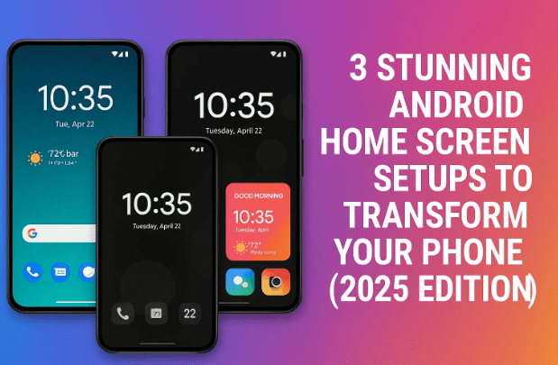
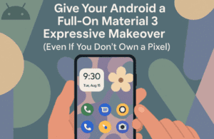
Your Android phone’s home screen is more than just a place to launch apps — it’s your personal dashboard. It can inspire calm, express creativity, or simply make everyday tasks more enjoyable. Unfortunately, most of us leave it cluttered with random icons and widgets, looking more like a digital to-do list than something that reflects our personality.
If you’re ready to give your phone a visual upgrade without sacrificing usability, you’re in the right place. Today, we’re exploring three unique Android setups — each one thoughtfully designed with a distinct personality. Whether you prefer minimalist calm, neon nostalgia, or soothing green freshness, these setups balance style with practicality.
Let’s start with the first design — a perfect blend of minimalism and energy.
1. Minimal Vibrant – Sleek, Balanced, and Beautiful
Minimalism doesn’t have to mean bland. The Minimal Vibrant setup manages to stay clean and organized while adding just the right amount of color to keep things interesting. It’s modern, balanced, and perfect for users who like simplicity without losing character.
Let’s unpack how it all comes together.
The Visual Layout
At first glance, you’re greeted by a bold “Friday” headline on top, paired with a slim orange bar that instantly adds life to the upper section. Below that, the date sits quietly in a neat, contemporary font (Sander style), maintaining a calm rhythm that fits the aesthetic perfectly.
Front and center sits the true highlight — the analog clock widget. Designed with a semi-circle split between black and orange, it feels like a cross between a timepiece and modern art. It’s symmetrical, clean, and adds a sense of order to your day.
Function Meets Design
To the right of the screen, compact widgets line up beautifully — providing weather, battery life, and a quick Google search. Each widget maintains consistent iconography and uses gentle color contrast to ensure readability without visual clutter. The smooth, rounded corners across elements make the design flow naturally from one section to another.
As your eyes move toward the bottom half, the setup transitions from airy minimalism to bold contrast. The music widget takes center stage, resting over a pitch-black background that makes the white monochrome icons pop elegantly.
Icon and Dock Styling
The icons themselves are small works of art — perfectly rounded, monochrome, and minimal. You can instantly recognize each app, but none of them demand attention. The dock below uses a pill-shaped design containing four essential shortcuts and one standout orange home icon, tying the whole color story together.
Everything about Minimal Vibrant feels deliberate — from the spacing to the palette. It’s calm but not cold, stylish but not distracting.


How to Recreate the “Minimal Vibrant” Setup
Let’s break down what you’ll need to replicate this setup on your Android device:
- Launcher: Smart Launcher 6
A lightweight launcher that focuses on smart organization and adaptive layout. - Icon Pack: Pasty White Icon Pack
Clean monochrome icons that perfectly fit the minimalist vibe. - Widget Pack: Palette for KWGT
Includes the stylish analog clock and curved mini widgets. - Wallpaper: Crayon Wallpapers (Flat category).
A simple off-white or soft-toned wallpaper to balance the bright accents.
Install KWGT, load the clock and info widgets, and align them near the top. Keep your dock icons centered and use gesture navigation for a clean finish.
Why It Works
Minimal Vibrant isn’t just pretty — it’s productive. It uses minimal screen real estate to deliver maximum function. Everything is one glance away, and yet, there’s breathing room between elements. The orange accent gives it personality, making it feel friendly rather than sterile.
If you love minimalism but want something that feels alive, this one’s a keeper.
2. Retro Neon – Bold, Flashy, and Unapologetically Cool
Now let’s crank up the energy a bit. Imagine your home screen as a neon album cover from the 1980s — vivid, glowing, and nostalgic. That’s Retro Neon, a setup that feels like a mix between synthwave aesthetics and digital futurism.
This layout doesn’t whisper — it sings in color.
The Wallpaper and Vibe
The foundation of this look is a deep navy wallpaper, overlaid with geometric shapes — one circular, one U-shaped — glowing in shades of orange, pink, and teal. The smooth gradients and concentric rings give it that CRT-screen warmth, like a scene from an old arcade game.
The moment you unlock your phone, you feel like you’ve stepped into a retro video intro.
Clock and Widget Design
At the top sits a clock widget that steals the show. Styled in an angular, geometric font with pastel highlights, it’s both futuristic and nostalgic. The soft pink and yellow tones play against the dark background, giving it depth and visual rhythm.
Right below, a calendar and weather widget combo adds functionality while keeping the retro vibe intact. The clean icons ensure the look doesn’t get too busy, maintaining a smooth balance between utility and design.
App Icons and Details
The app icons here are where things really get fun. Each one sits on a vivid colored pad — think neon lime, magenta, or orange — and carries a faint inner glow. They almost look like little stickers from a retro arcade cabinet. Despite the variety of colors, the consistent shapes and spacing make the screen look cohesive rather than chaotic.
At the bottom, a Google Search bar with multicolored strips ties everything together, adding the finishing touch — like the final synth chord in an ‘80s track.
How to Recreate the “Retro Neon” Setup
To bring this neon masterpiece to life, here’s what you’ll need:
- Launcher: Nova Launcher
Perfect for precise icon placement, grid customization, and gesture control. - Icon Pack: Doodle Icon Pack
Vibrant and dynamic icons that match the neon aesthetic. - Widget Pack: ColorBlobs KWGT & Frizzy KWGT
Use these for the clock and info widgets. - Wallpaper: Download here (Retro Neon Theme)
Why It Works
Retro Neon celebrates color unapologetically. It’s energetic, fun, and uniquely nostalgic. But beneath the flair, it’s well-structured — icons are consistent, widgets are aligned, and everything stays legible even under vibrant tones.
This setup is perfect if you love visual drama, nostalgia, and creative chaos done right. It’s your personal time machine to the synthwave era — right on your Android screen.
3. Something Green – Calm, Refreshing, and Serene
After all that neon excitement, it’s time to slow things down. The Something Green setup is for users who crave calm and balance. It’s refreshing without being sterile — a digital sanctuary of soft tones and clean symmetry.
Let’s explore how it achieves that soothing magic.
The Wallpaper and Overall Mood
This setup begins with a high-resolution 3D abstract wallpaper, featuring mint-green bands gently wrapping around smooth white surfaces. The interplay of light and shadow creates subtle depth, making the screen feel airy and tranquil.
It’s a look that instantly relaxes you — the visual equivalent of a cool breeze on a hot day.
Widgets and Typography
Front and center, you’ll find a handwritten “Monday” widget, giving it a personal, almost journal-like character. Below that sits the date, neatly tucked inside a dual-tone tag. Together, they add warmth and personality to the interface.
The choice of fonts here matters — clean sans-serif text mixed with a slightly handwritten element keeps things friendly yet modern.
Icons and Arrangement
The app icons use a soft green bubble design with matching thin-line art — no gradients, no harsh edges, just quiet consistency. The color palette stays uniform, ensuring nothing clashes or distracts. You can recognize every app instantly, but none overpower the composition.
This harmony extends to the widget shapes and curves — everything aligns with the wallpaper’s smooth motion, creating a sense of unity.
How to Recreate the “Something Green” Setup
Here’s what you’ll need to replicate this calm aesthetic:
- Launcher: Lawnchair Launcher
An open-source, lightweight launcher with Pixel-like gestures. - Icon Pack: Pix Material You Icons
Adaptive icons that fit Android’s modern Material You design language. - Widget Pack: Elements KWGT
Contains soft and minimal widgets that blend beautifully with the green theme. - Wallpaper: Pix Wallpapers collection, available on F-Droid or third-party wallpaper apps.
Once installed, focus on spacing — keep widgets centered and icons evenly distributed. Avoid adding unnecessary shortcuts or pop-ups to maintain that zen-like minimalism.
Why It Works
Something Green succeeds because it embraces restraint. Every element complements the others — no sharp colors, no mismatched shapes. It’s ideal for anyone seeking balance between design and simplicity.
Unlock your phone, and instead of visual overload, you’re greeted by calm — a rare feeling in our screen-filled lives.
Comparison of All Three Setups
| Setup Name | Theme Style | Best For | Key Apps Used |
|---|---|---|---|
| Minimal Vibrant | Modern, balanced minimalism | Productivity lovers | Smart Launcher 6, Palette KWGT, Pasty Icons |
| Retro Neon | Bold, colorful, nostalgic | Creative users, retro fans | Nova Launcher, Doodle Icons, Frizzy KWGT |
| Something Green | Calm, elegant, nature-inspired | Focused users, minimalists | Lawnchair Launcher, Pix Material You Icons, Elements KWGT |
Each setup speaks to a different mood — and the beauty of Android is that you can try all of them within an hour. Mix, match, and adjust until your home screen feels like you.
Frequently Asked Questions
Q1. Are these setups beginner-friendly?
Yes! Each setup only requires installing a launcher, an icon pack, and a KWGT widget pack. Once installed, you can use the widgets provided and adjust grid sizes to match the look.
Q2. Do I need KWGT Pro for these widgets?
Most widget packs (like Palette, ColorBlobs, and Elements) work best with KWGT Pro. It unlocks customization features and allows importing widget files without restrictions.
Q3. Will these setups affect my phone’s performance?
No. In fact, most of these launchers are optimized for speed. Smart Launcher and Lawnchair are lightweight, while Nova is known for stability. Avoid using multiple live widgets at once if your device is older.
Q4. Can I use different wallpapers or colors?
Absolutely. The key is harmony — choose colors that complement your widget and icon style. You can tweak tones to match your taste while maintaining the same structure.
Q5. Are these setups available for iPhones?
Unfortunately, no. iOS doesn’t allow third-party launchers or full widget customization. These setups are exclusive to Android’s flexible ecosystem.
Final Thoughts
A beautiful home screen doesn’t just make your phone look good — it changes how you feel when you use it. Minimal Vibrant, Retro Neon, and Something Green each offer a different flavor of design, proving that personalization can be both artistic and functional.
So, whether you’re a productivity-focused minimalist, a nostalgia-loving dreamer, or someone who just wants peace on their lock screen, there’s a setup here for you.
Experiment, adapt, and enjoy — because your home screen deserves more than just app icons. It deserves personality.
Disclaimer
All apps and widget packs mentioned here are available from official sources like Google Play or verified developer sites. KWGT widget files are community-created and safe to use, but always scan APKs before sideloading from third-party links. The author is not affiliated with any of the creators or repositories mentioned.
#AndroidSetup #KWGT #NovaLauncher #Lawnchair #MinimalHomeScreen #Customization #BestSetups2025 #AndroidDesign